
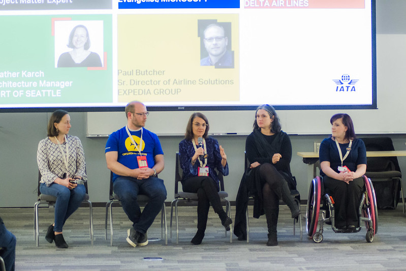
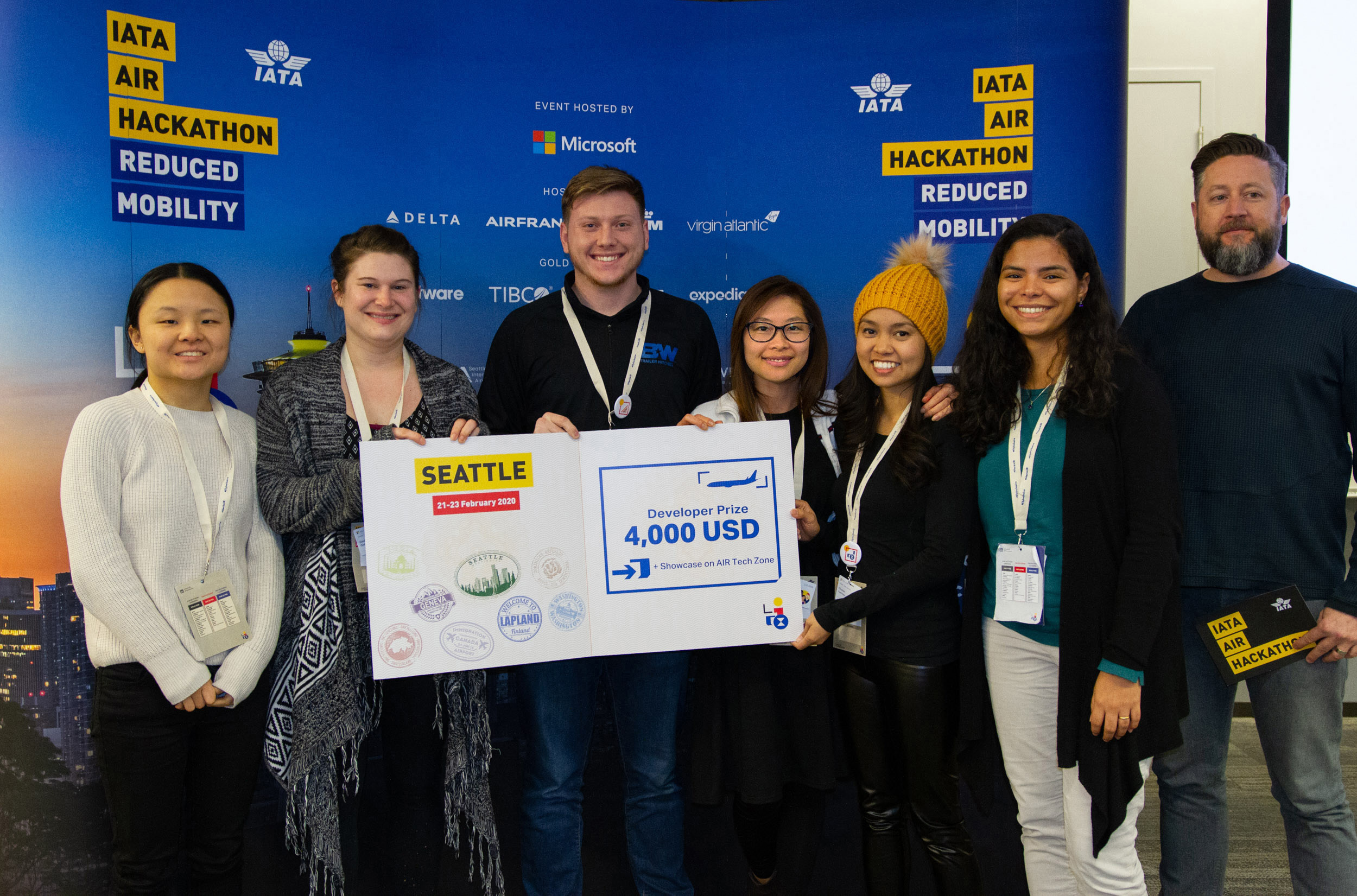
This is a project from an international hackathon sponsored by IATA (International Air Transport Association), Microsoft, Boeing, and major airlines and travel organizations.
In this hackathon, teams were given a task to build solutions to enhance:
User Research
Info Architecture
UX/ UI Design
Prototype
Presentation
Figma
Photoshop
Material Design
Android
3 days*
3 Developers
2 UX Designers (inc. me)
1 Project Manager
User Research
Info Architecture
UX/ UI Design
Prototype
Presentation
Figma
Photoshop
Material Design
Android
3 days*
3 Developers
2 UX Designers
1 Project Mgr
Prior to the 3-day onsite event, teams were allowed to strategize & do pre-work. Our team originally agreed to undertake the booking experience challenge. We brainstormed and researched. I did a bunch of research on my own and asked wheelchair users in my network to share their booking experiences.
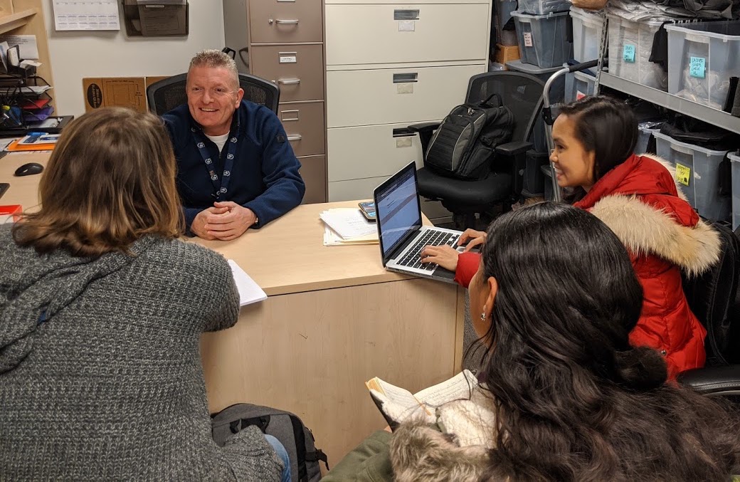
Our team also went to SEA-TAC airport to interview the head of the official wheelchair vendor there. We also observed their operations in their control room and around the airport.
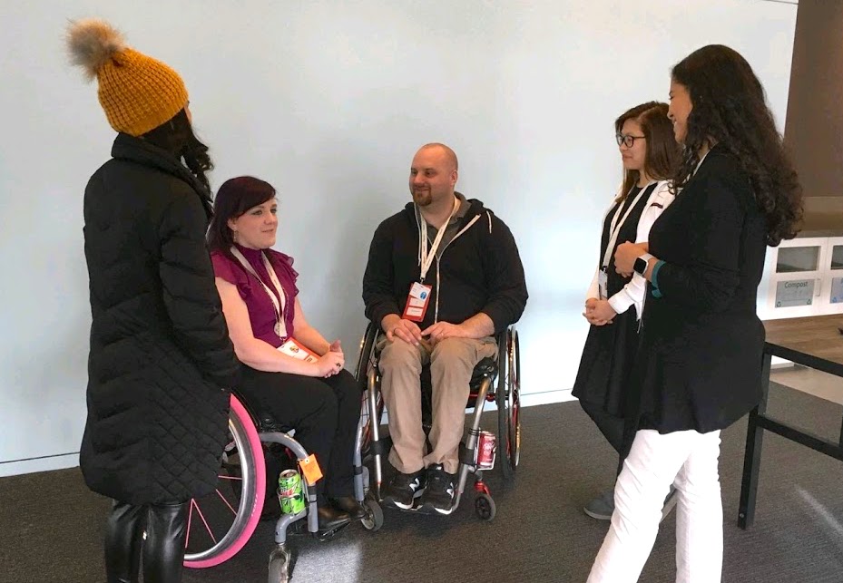
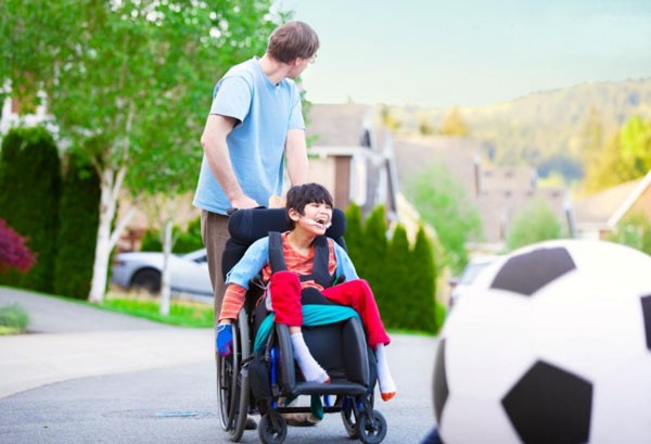
We were given the option to choose from different personas the organizer had predetermined. We chose David & Martin Martinez. The wheelchair users at the event share the same fear and frustrations with David.
8 y/o, Male, Wheelchair User
37 y/o, Male, Martin's Father
My co-designer and I worked through the night to organize the user flows. We came up with a separate flow for the vendor (airline/ airport staff) and the customer (wheelchair users).
To rapidly move on to wireframing, we kept the user flows really simple.

Because it wasn’t part of the judging criteria, we spent the least amount of time on branding. We decided to use Alaska Airlines' company colors for our design since half of our team works there.
I came up with the brand name “WheelTrack” which is a portmanteau of “wheelchair” and “tracker.” The pronunciation all sounds like "We'll track." The shorter version of the project's promise - "We will track your devices for you."
With Android as our base, we used Google’s Material Design guidelines for typography. We used Roboto for the main typeface and Lato for the headings.
Lato was chosen due to its semi-rounded details that give a feeling of warmth, while its strong structure provides stability and seriousness.
We reused Android screens from previous projects to create wireframes & mockups. We quickly came up with a prototype and had it tested by a Delta Airline manager, an IATA representative, & a customer.
These are the top feedback we got:
My co-designer focused on the customer-facing screens and I focused on the vendor-facing screens. These are the final mockups I made.
Our last minute decision to pivot turned out for the better. We received unanimous positive feedback for our prototype and won the Special Recognition Award.
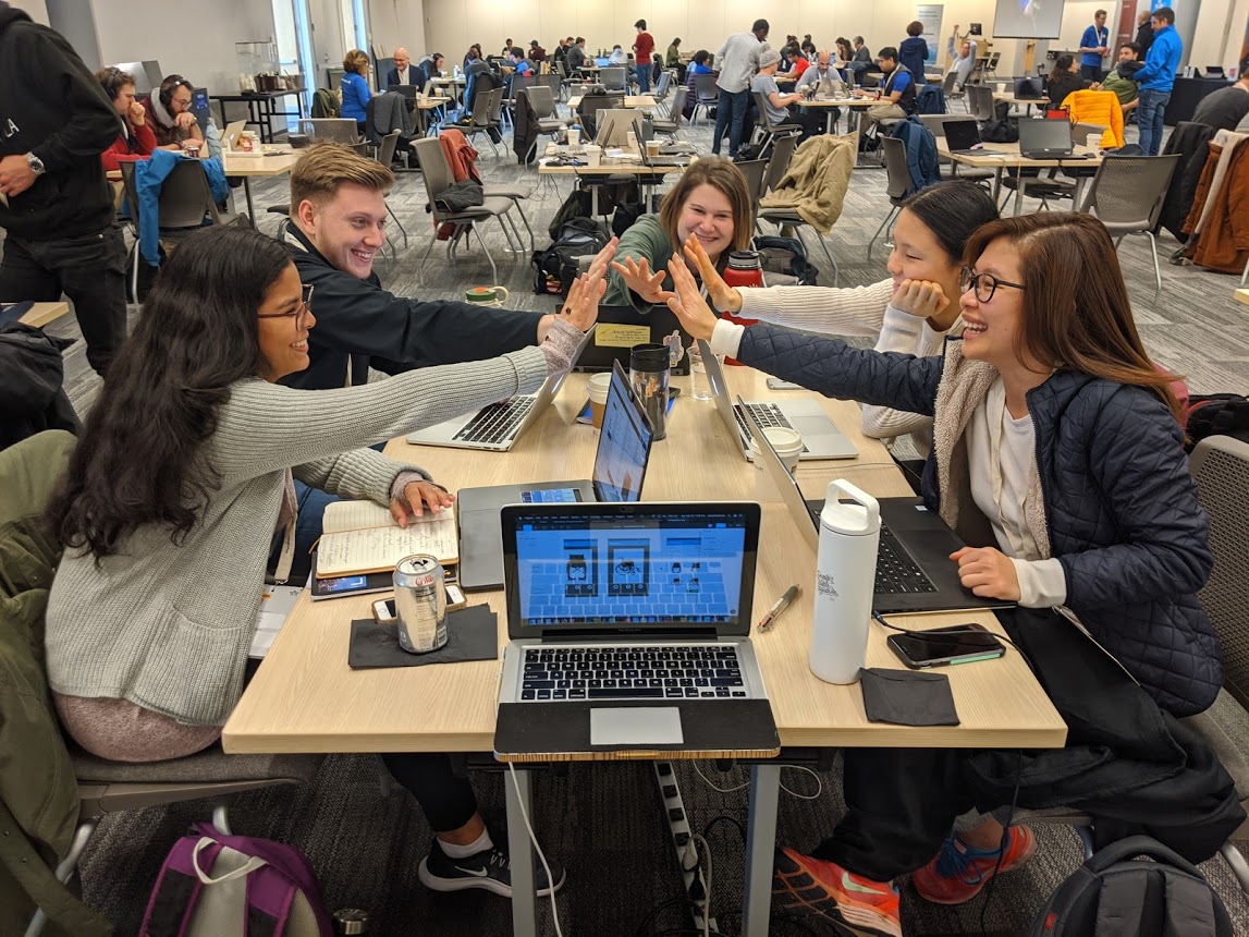
It was an eye-opening experience for me. As a former nurse, I was humbled to know how much I still don’t know about wheelchair users. It was heartbreaking listening to all their challenges. At the same time, it was heartwarming knowing how many people and organizations are doing their part to help.
As a hackathon participant, I learned how to quickly change strategy when presented with more substantial data. It taught me to detach myself from my previous work and be supportive of the team’s decision.
Once more, I was reminded to put the user's needs first while making sure the business needs are being met as well.
On the customer side, I would make the app more accessible. Possibly making it operational using other methods - voice, gesture, etc. I would also consider their transportation experience to & from their homes to the airport.
On the vendor side, I would do more research on their personnel, workflow, & protocols. I would also look into other existing processes & technologies we can leverage that we have probably overlooked during the limited time of the hackathon.
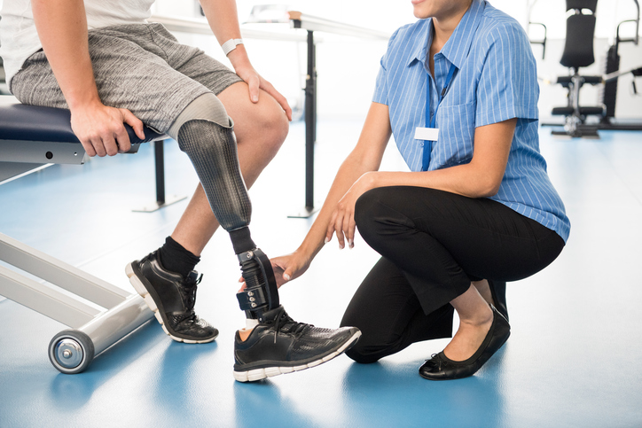
After the hackathon, I remained in contact with Lindsey & Wesley Becker (wheelchair user advocates at the event). I also started consulting for a startup that serves people with limb loss & limb deformities.
I hope to continue sharing the knowledge and skills I got from this hackathon and the unique combination of my medical and design background.