
This is a passion project that I also used as a school project.
Back in 2016, I was selected to represent my country at the Global Entrepreneurship Summit in Standford University. I was picked based on my business idea of helping migrant workers prepare for their homecoming. This project is a part of that idea.
User Research
User Survey
User Interviews
Info Architecture
UX/ UI Design
Wireframing
Branding
Prototyping
User Testing
Figma
Illustrator
Photoshop
Draw.io
Material Design
Zoom
SoGoSurvey
Maze
UsabilityHub
InVision
User Research
User Survey
User Interviews
Info Architecture
UX/ UI Design
Wireframing
Branding
Prototyping
User Testing
Figma
Illustrator
Photoshop
Draw.io
Material Design
Zoom
SoGoSurvey
Maze
UsabilityHub
InVision
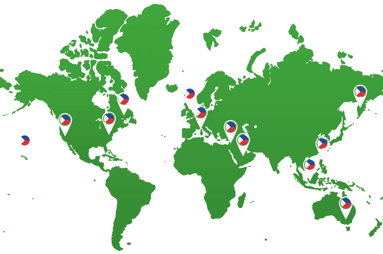
Despite bringing in $32 billion worth of remittances in 2018 alone, 1 out of 10 Overseas Filipinos come home bankrupt.
It is a sad reality that affects the 9th largest immigrant population in the world. With the advancements in fintech & tech in general, I'm surprised that as of 2019 there is no app yet that is specifically designed to serve the 10 million Filipinos overseas.
This is my attempt at creating an app that can help them manage their personal finances.
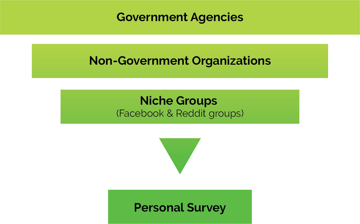
Before I made my own survey and interviews, I initially used these 3 data sources to guide me on making my questionnaire.
has the biggest population of permanent Filipino immigrants at 3.4 million
has the highest concentration of temporary Filipino immigrants at 1 million
Of Overseas Filipino Workers (OFWs) are 25- 44 y/o
Major regions in the Philippines where most OFWs are originally from
Here are some of the statistics from the Govt and NGOs who have been following the Overseas Filipino population for decades.
My data showed that bulk of my potential users are:
Use their smartphones to management their finances in some way
Have never used a comprehensive personal financial management app ever
Have savings/checking accounts in both the Philippines and their current country of residence
Are maintaining pension plans in the Philippines only
I realized that though Overseas Filipinos have unique financial challenges, bulk of their top concerns boils down to the basic financial challenges of most people.
I also asked specific questions that gauge their usage and familiarity with financial management tools to see the following:

26, Middle East
Flight Attendant

38, North America
Nurse Supervisor

Out of all the apps analyzed, Intuit’s Mint has the most number of features the users need. But it lacks some of the vital elements that are specific to the target audience:
To establish necessary features of the app, I created a list of user stories based on potential user tasks. These user stories were refined and prioritized to define a minimum viable product.
See Full User StoriesThis visualizes the steps a user takes to accomplish each user story. The process began with sketching out multiple iterations of the ff:
After sketching a few quick iterations, I finalized the wireframes in Figma. They were used to create a clickable prototype in Invision for user testing.
See Wireframe Prototype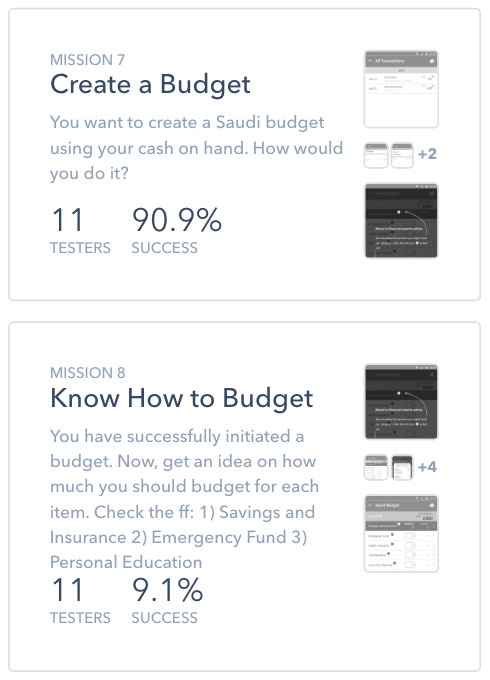
User testing was conducted remotely using Maze, Messenger & Skype. The feedback from users indicated I need to rethink some of the user flows mainly the
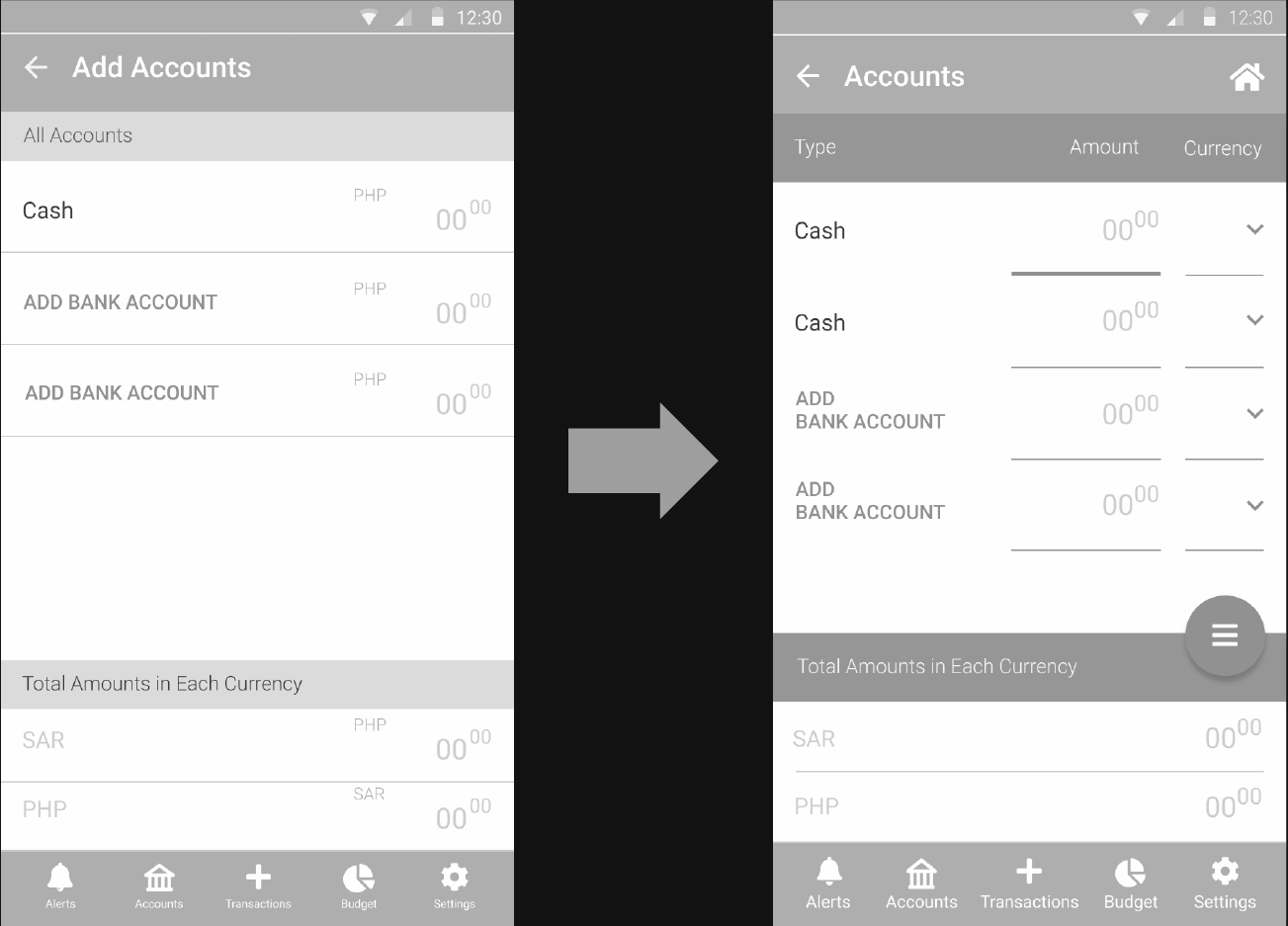
Two screens that got changed based on users’ feedback.
Add Accounts
The addition of the line indicators helps guide the user on where to start.
Budgets
The line indicators, the labels and the examples given guides the user on where to start and what to write.
The floating button allows the budget screen to have the same app bar as the rest of the screens.
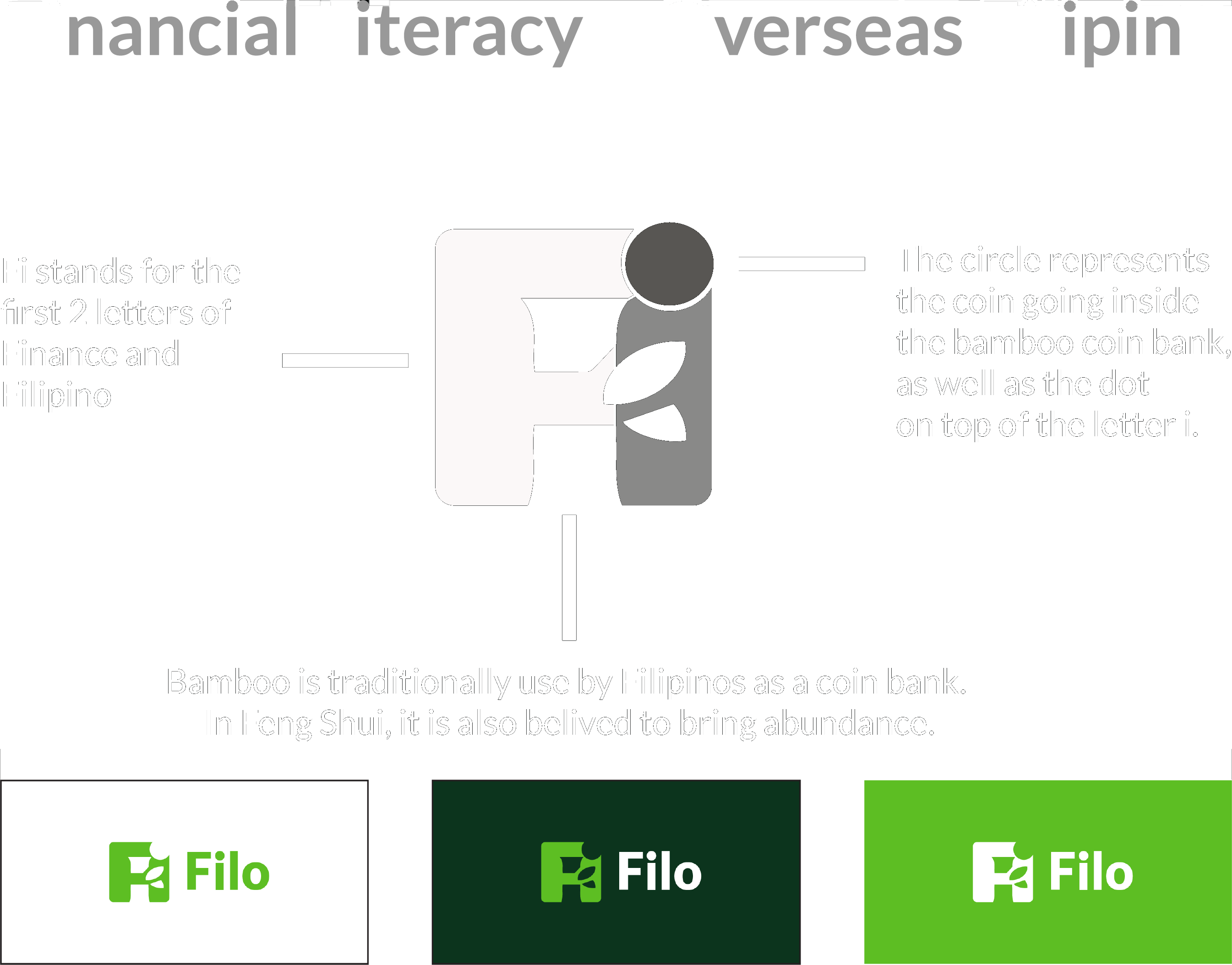
The name Filo is a play of the predominant letters of the 2 phrases- Financial Literacy & Overseas Filipinos.
For the logo, I want the brand name be reflected on the logo itself thus the letters “Fi”. I also thought of an object that Filipinos associate money with. Bamboo came to mind.
Because I’ve been fascinated with negative space logos ever since I learned about the infamous arrow in the FedEx logo, I decided to challenge myself to create one for this project.
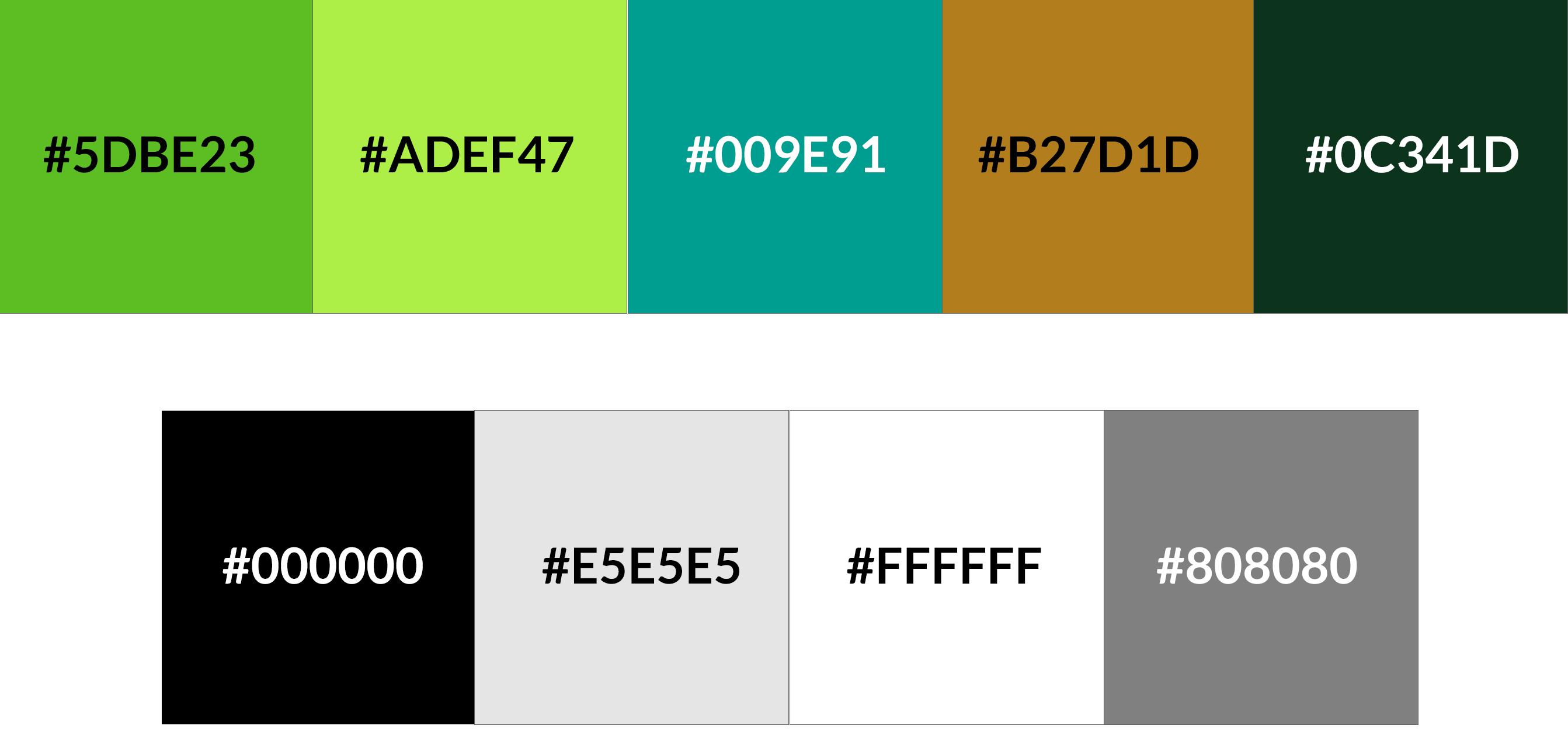
Green for money & growth.
Aqua/ Blue for fluidity & security.
Brown for simplicity & practicality.
Since this design is made for Android, I decided to mostly follow Google's Material Design guidelines- from choosing Roboto for its typeface, to its font, size, and case.
Lato, on the other hand, was chosen for the logo and headings due to its semi-rounded details that gives a feeling of warmth, while its strong structure provides stability and seriousness which is apt for the purpose of the app.
For refinement, I used UsabilityHub, Messenger, Slack and Reddit to perform preference tests.
During the course of testing, I realized that different groups are better for different types of testing.
For the final test, I did another set of user tests via in-person setup, and remotely via Zoom and Skype. Most of the previous flaws had been fixed but some remain to be up for redesign.
See Final PrototypeBecause this is the very first project that I had to make from scratch, I learned so much from it. I made a full documentation of everything I learned from each step of the design process. What worked? What didn't? What were my doubts? What surprised me the most? What would have I done differently? All of these were discussed in detail. For TL;DR version, here are my top takeaways: