This is a hackathon project.
I joined a Samsung B2B 3-day hackathon in Seattle. We were tasked to team up with attendees on the spot and teams must be composed of atleast 1 designer, 1 developer and 1 project manager. Once the team is formed, we had to choose the project we want to work on based on the pre-set enterprise projects Samsung prepared.
Due to the healthcare background of both I & another teammate, we decided to take a healthcare project. I became the dedicated designer of the team.
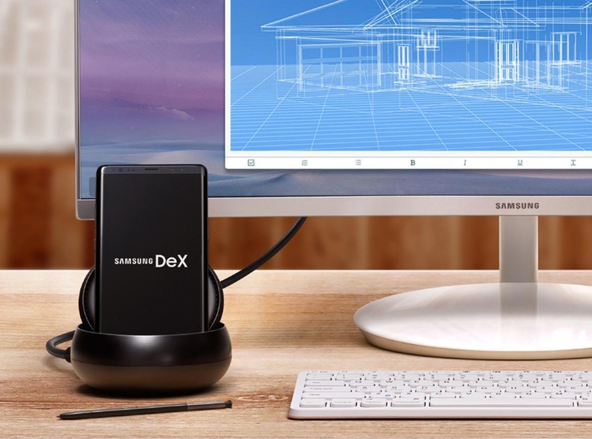
We were also required to use Samsung technologies both for hardware (Samsung Galaxy Note 10) and software (DeX & Knox).
User Research
Info Architecture
UX/ UI Design
Prototype
Presentation
Figma
Photoshop
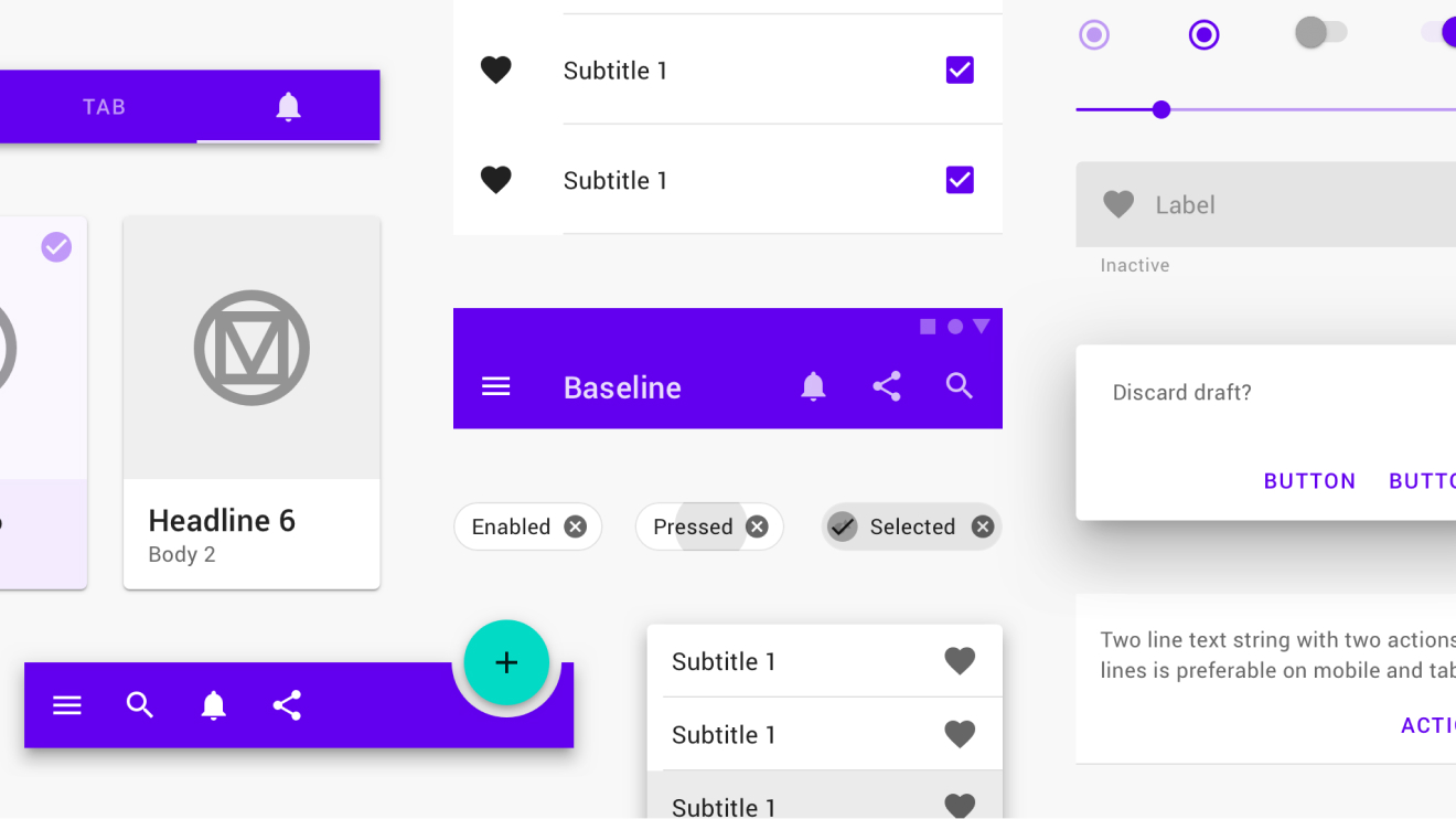
Material Design
Youtube
Galaxy Note 10
Trello
User Research
Info Architecture
UX/ UI Design
Prototype
Presentation
Figma
Photoshop
Material Design
Youtube
Galaxy Note 10
Trello
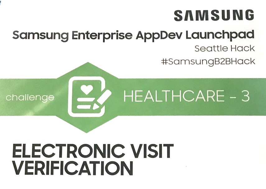
Electronic Visit Verification
What’s the customer need?
The Cures Act mandates all Medicaid personal care services must implement electronic visit verification (EVV) for in-home visits by January 2020. And all home health services must meet the same mandate by January 2023. Agencies need to implement a solution that is in place, on time, cost-effective, and efficient.
Target customer
- Personal homecare agencies
Target audience
- Owner
- General Manager
- Procurement
- Finance Director
Customer pain points
- Completing the EVV process in real-time
- The need for a low-cost, reliable solution.
Since this is only a 3-day project, we didn’t have the luxury of doing extensive research. We forego user surveys and interviews and instead turn to online research and my personal experience as a nurse. The best online source I found was a Youtube video of a home health nurse detailing her usual routine when visiting patients.
Top takeaways from the video:

27, F
Registered Nurse
Goals:

48, F
Nurse Manager
Goals:
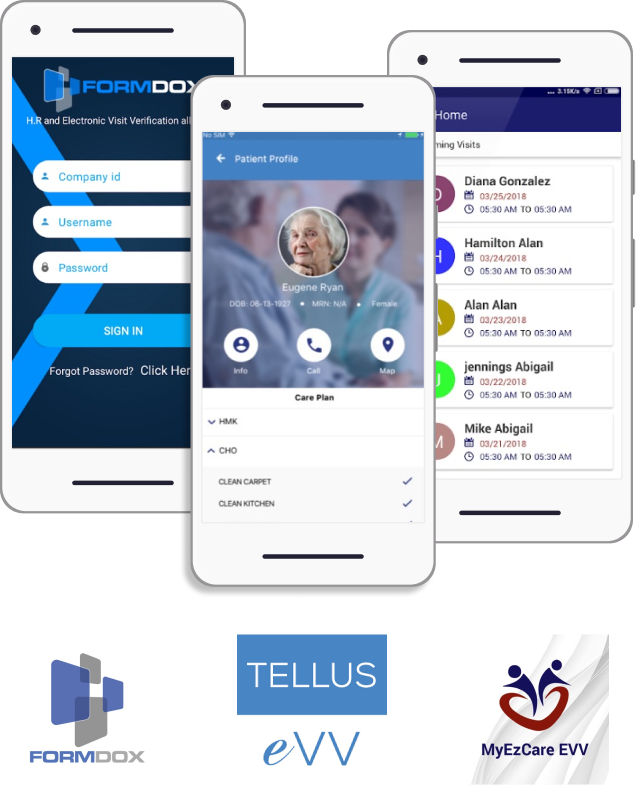
Because all existing EVV’s need a member’s login, we weren't able to get into any of them to play around to investigate further. We had to completely rely on the previews in the app store and random online images. These are some of the wireframes I found from a few companies.
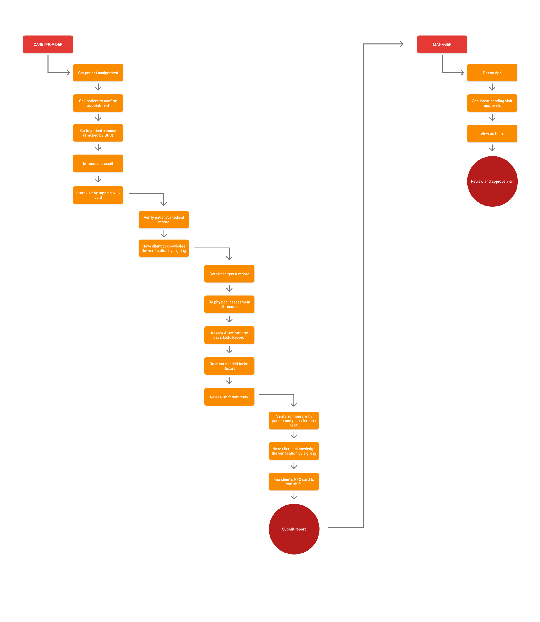
Due to time constraints, we decided to design only for new visit experience. Meaning a nurse who had previously visited other patients but is visiting a new patient. Here are our assumptions for the design.
For the sake of preventing fraud - the main purpose of EVV, there were 2 main user flows for this app:
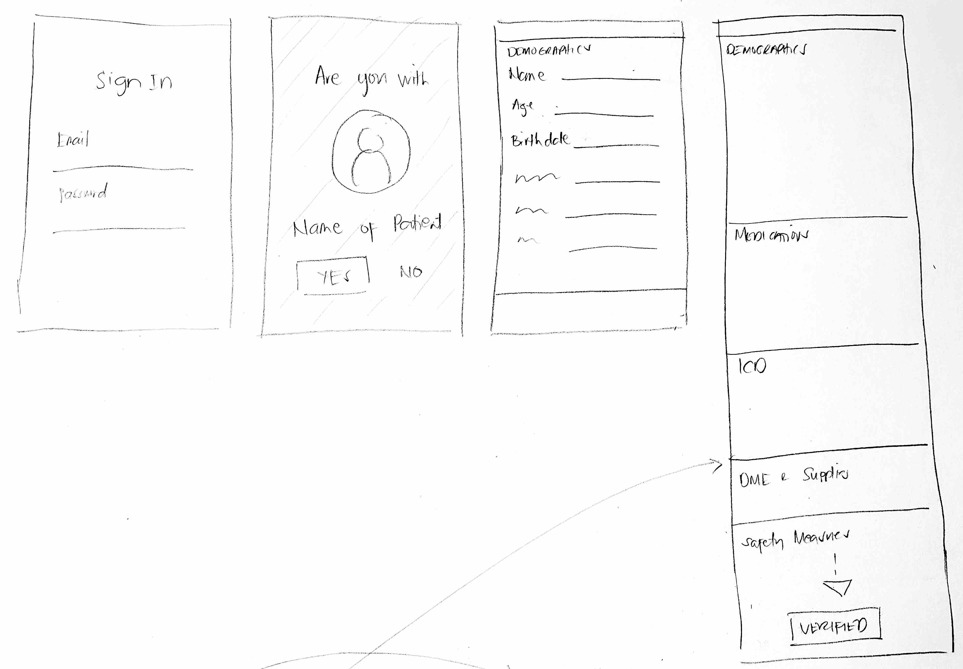
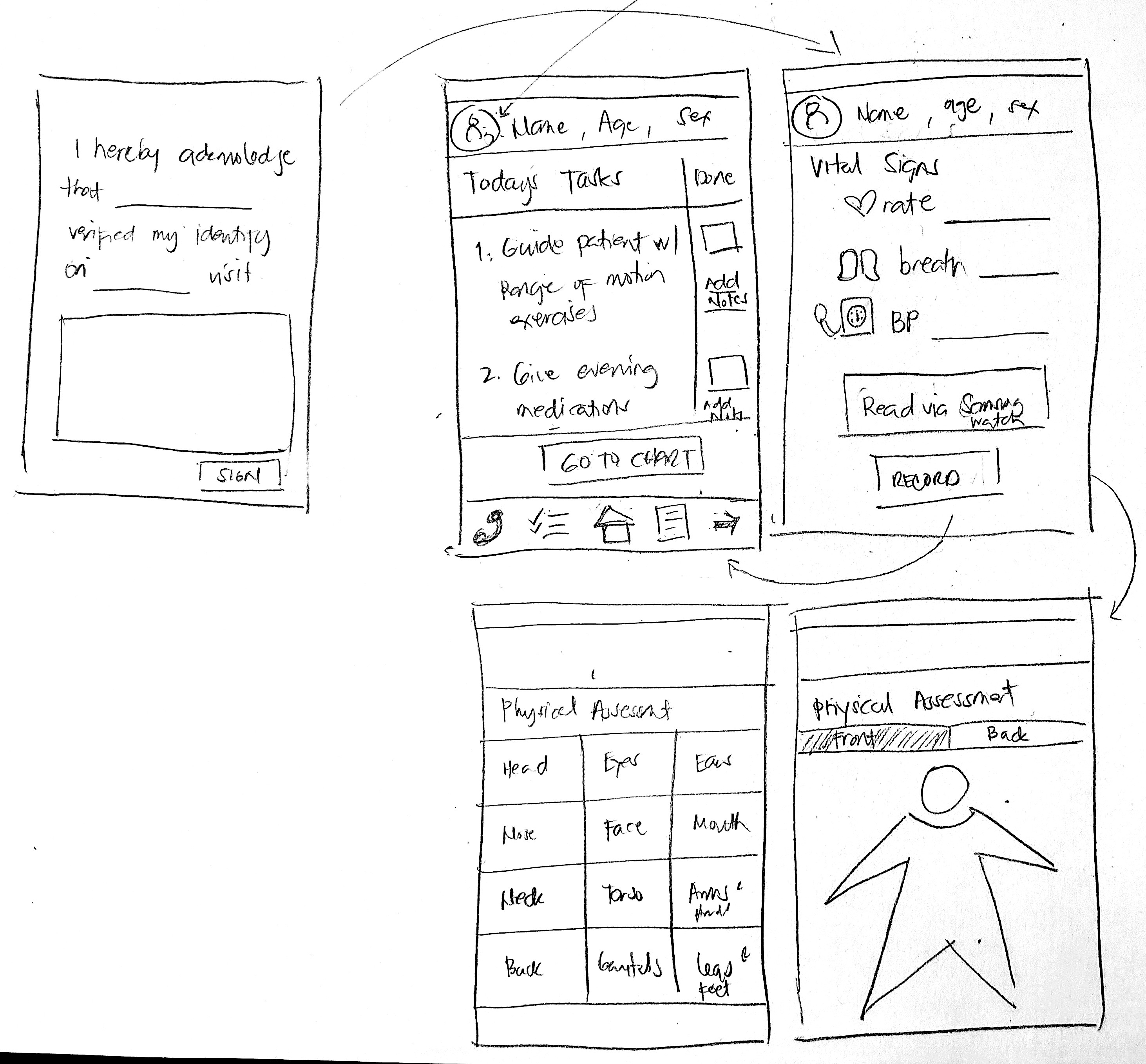
I did a very quick pen and paper low fidelity wireframe and presented it to the team for critique and input. Since I did most of the research and they trusted me due to my authority in the nursing field, they actually didn’t do much critiquing. I think it’s an inherent limitation of hackathons of this kind due to the limited time and manpower teams have. If this was a real-world project, I would have consulted authorities in the field to check the strengths and weaknesses of the design and iterate before moving into high fidelity wireframes.
I also skipped creating digital lo-fi wireframes for the same reason, and jumped right into hi-fi wireframes.
The name & logo weren’t part of the judging criteria so we didn’t spend any time brainstorming on it. When the event ended, we still didn’t have a name or logo for our product. The name and logo you see now are my additions post-competition.
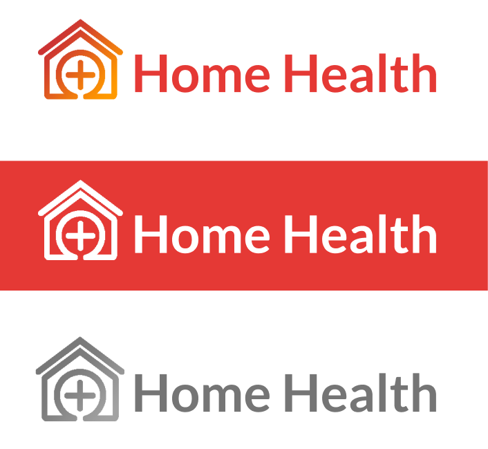
Like my other projects, I want the name to be short and easily identifiable with the product- Home Health was the obvious choice.
As with the logo, I aimed for a basic-looking and straightforward logo with the silhouette of a house and the cross associated with medical facilities.
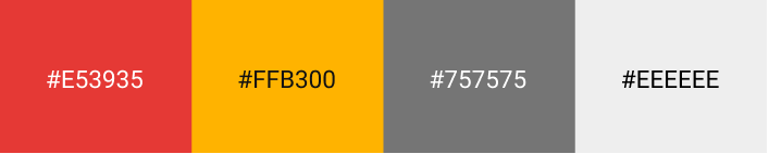
Red for healthcare.
Orange for wellness.
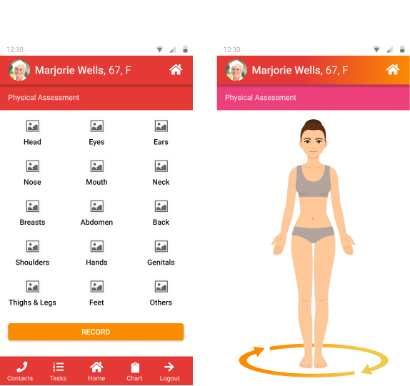
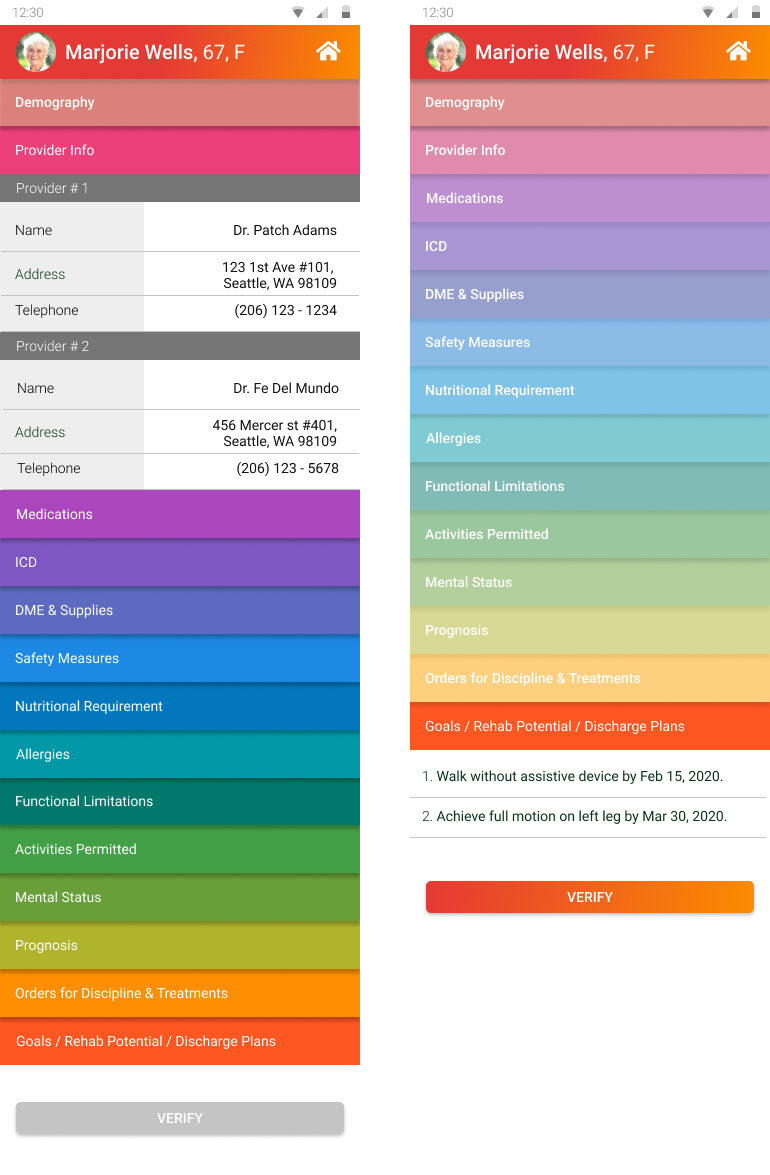
I also chose to utilize a spectrum of different colors as an identifier of each tab of the medical forms, reminiscent of a well-designed filing drawer. This way it’s easier for caregivers to sort the list of text-heavy pages.
As part of proper & complete client record verification, each tab’s background color lightens indicating that the tab has been opened already. This provides a visual cue for the caregiver to make sure they had not skipped a section.
In addition, the font weight becomes slightly heavier on the lighter background to achieve better contrast.
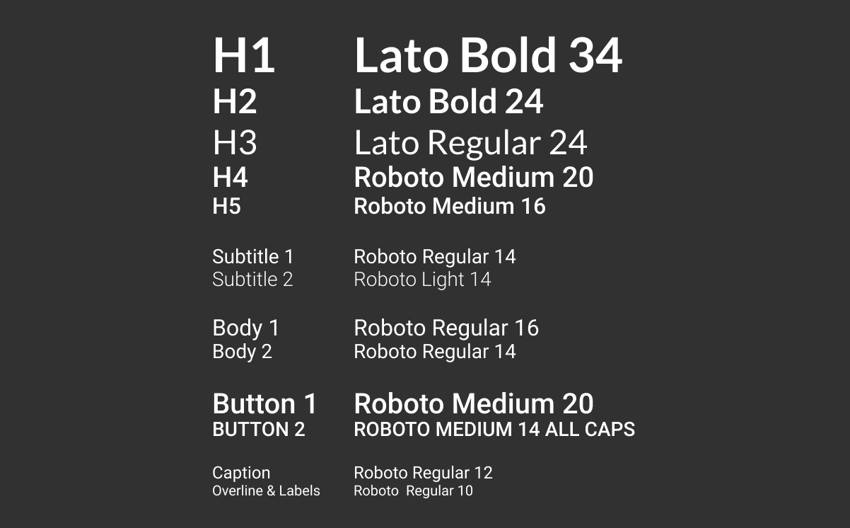
Samsung runs on Android so we used Google’s Material Design guidelines for the typography. We used Roboto for the main typeface and Lato for the headings.
Lato was chosen due to its semi-rounded details that give a feeling of warmth, while its strong structure provides stability and seriousness.
Again, due to time constraints, I decided to reuse the Android UI I already have from a previous project. I adopted the branding colors of red and orange but decided to be more playful and use gradients instead of solid colors. This gave the product a more modern look.
For the preference tests, I did a quick guerilla test among my teammates. This is one of the screens they asked a revision for and the redesign I made.
Within the 3 days we were given, we successfully made the timestamp appear after the NFC device was tapped on the Samsung Note 10.
We also won the Most Original and Inventive UX/UI award.

I really enjoyed designing Home Health. As a former nurse, it’s a goal of mine to design a healthcare product. The hackathon experience was eye-opening because it was the first time I had to work with a team to build a product. It gave me a more holistic view of the roles of each member and how different front-end and back-end development are.
As per the user interface itself, I am happy on how it turned out especially for something built in just 3 days. Given that I reused most of my elements from previous projects, I realized how big of a difference a library can make for decision making and speed of building overall. I didn’t need to make the tiny decisions on text sizing, spacing, drop shadows, etc. Instead, I was able to focus on the big picture- the vital data that needs to be present in the app, the security measures, how to address the customer's pain points.