This project was a part of Microsoft's broader shopping initiative. My primary focus was on the Deals mini-app within the Microsoft Start app, a specific mobile shopping feature. Upon joining the team, some parts of the product were already live, having been contributed to by 2-3 designers. Additionally, certain elements were developed by engineers and product managers with limited input from designers. My role involved designing multiple user experiences and creating marketing assets for this product. In this case study, I will concentrate on the receipt scanning and gas cashback experiences.
Disclaimer: Parts of the work I contributed to have since been updated, are not currently live, or have not yet been deployed yet. Therefore, the designs presented here may not fully represent the current version in production.
UX/UI Design
User Research
Info Architecture
Prototyping
Marketing Asset Design
Presentation
Figma
Photoshop
UX Lab
Fluent design system
Other internal UI kits & research programs
8 months
9 engineers
2 pms
3-6 designers
2 copywriters
User Research
Info Architecture
UX/ UI Design
Prototype
Presentation
Relationship building with partner teams
Figma
Photoshop
UX Lab
Fluent Design System
Bing Design System
10 months
6- 15 people (engineers, pms, designers, copywriters, business developers, marketing, legal, etc.)
The initial research was largely done before I joined the team. In a nutshell, these are the goals that the team had identified.

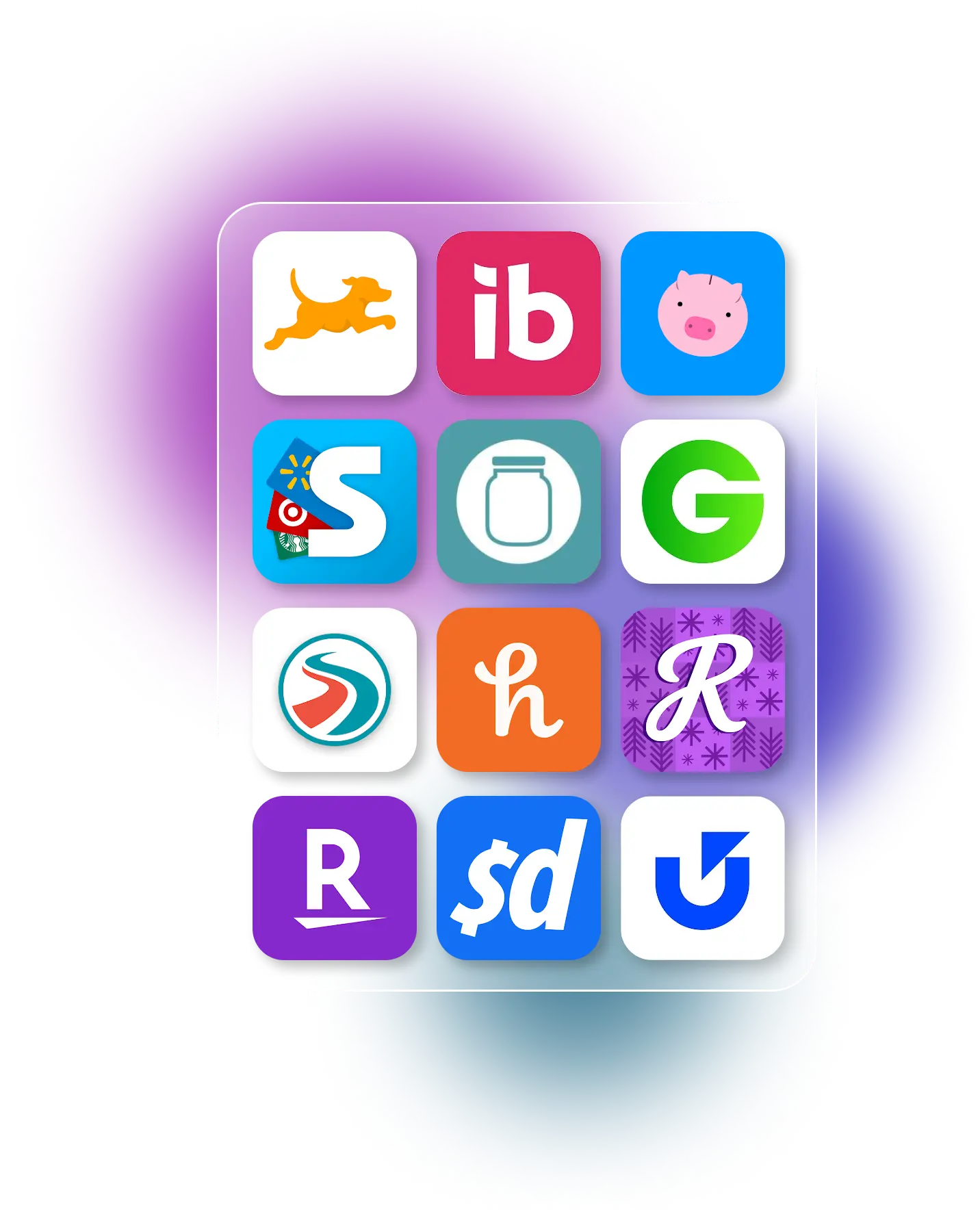
In our market segment, we face considerable competition. In the realm of receipt scanning, our competitors include Fetch, Ibotta, Receipt Jar, Receipt Hog, ShopKick, and others. For online deals platforms, prominent players are Honey, RetailMeNot, Rakuten, Groupon, and Slickdeals, among many. In the gas discount aggregator category, we compete with Gas Buddy and Upside.
As mentioned earlier, I designed two key features:


As I stated earlier, 2-3 designers worked on the project before my arrival. Unfortunately, during their tenure, there was no clear directive regarding which design system or UI kit to adhere to. As a result, some designs were based on the Windows UI kit, others on Fluent 1, and some on various internal UI kits. I even encountered designs that mixed web components with mobile components.
Initially, this lack of uniformity wasn't overly apparent, but as the project progressed and more components were developed, I had to decelerate the asset production. To establish consistency and ensure a sustainable design process for the team, I conducted an audit of the existing designs and created a comprehensive design system guide. This system became the standard for my work.
My primary base was Fluent 2 iOS. When this didn't meet our needs, I turned to the Commerce UI kit. If that still wasn't sufficient, I designed custom components, which I then contributed back to the Commerce UI kit.
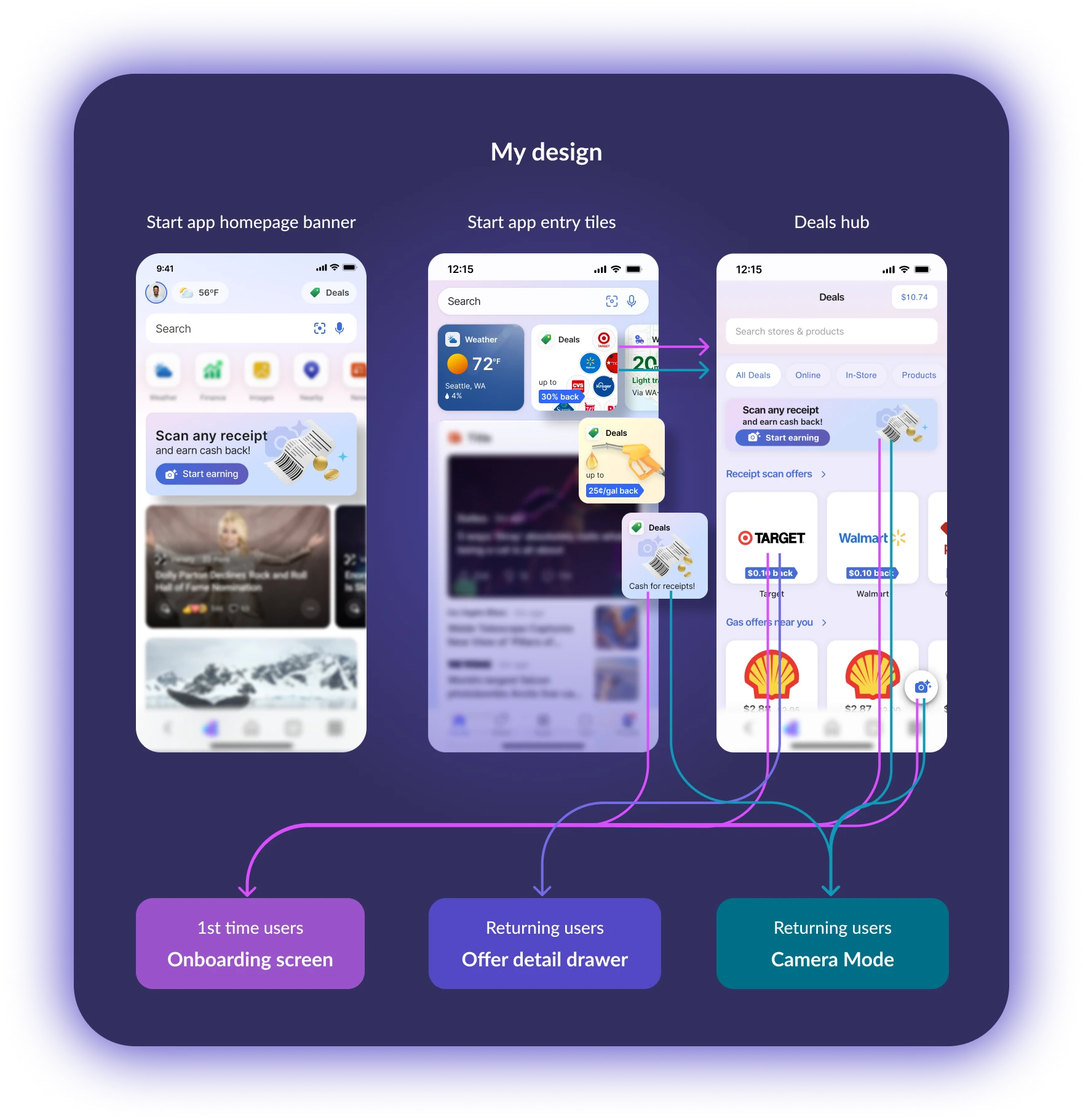
I explored various approaches to effectively showcase the main features of the Deals hub including receipt scanning within the constrained space of the Start app homepage. This coincided with the Start team’s revamp of the homepage and the shopping team’s unification effort. Thus, this design evolved very quickly.
Once users are in the Deals hub, they have multiple entry points to the camera mode.


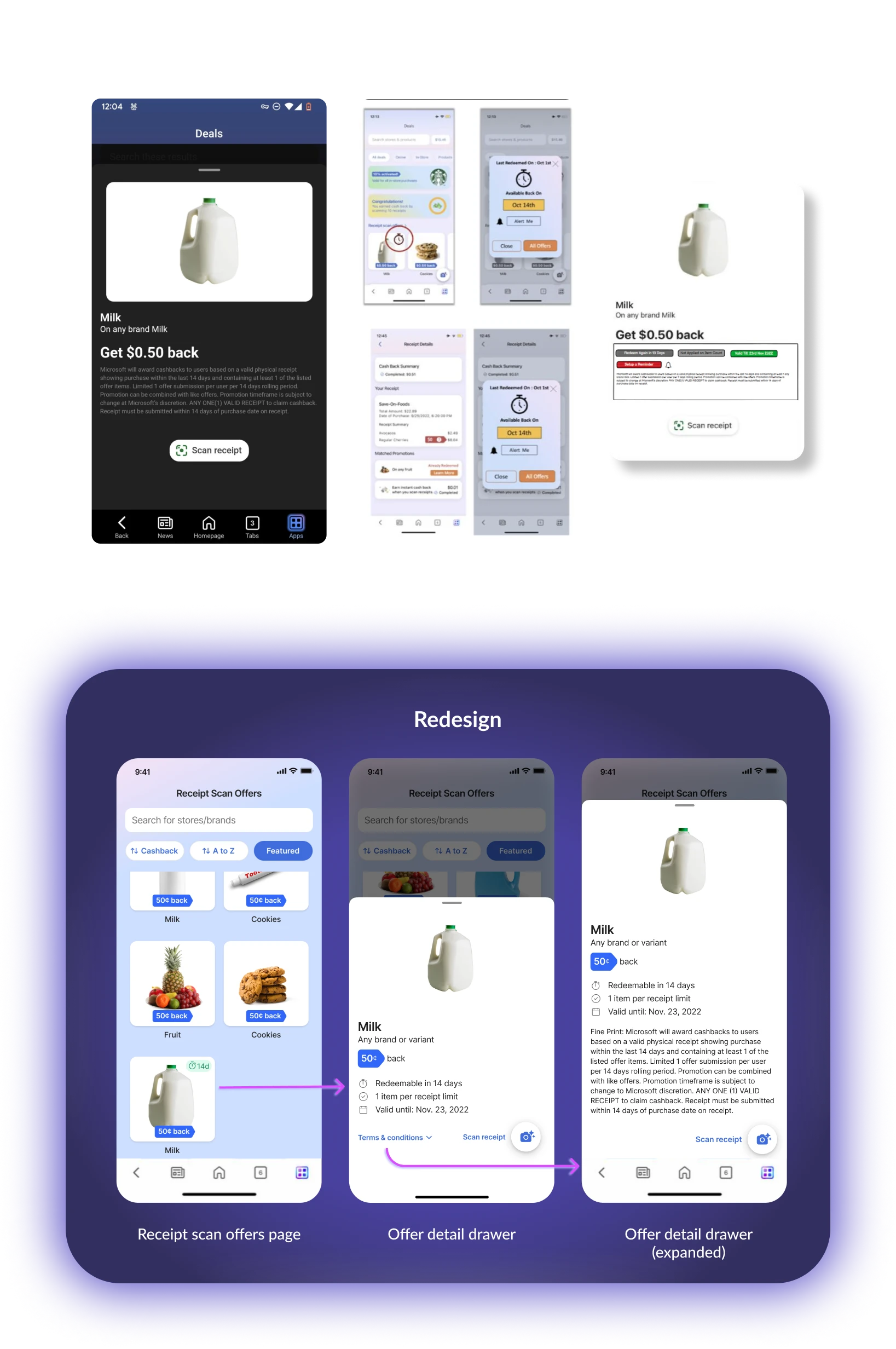
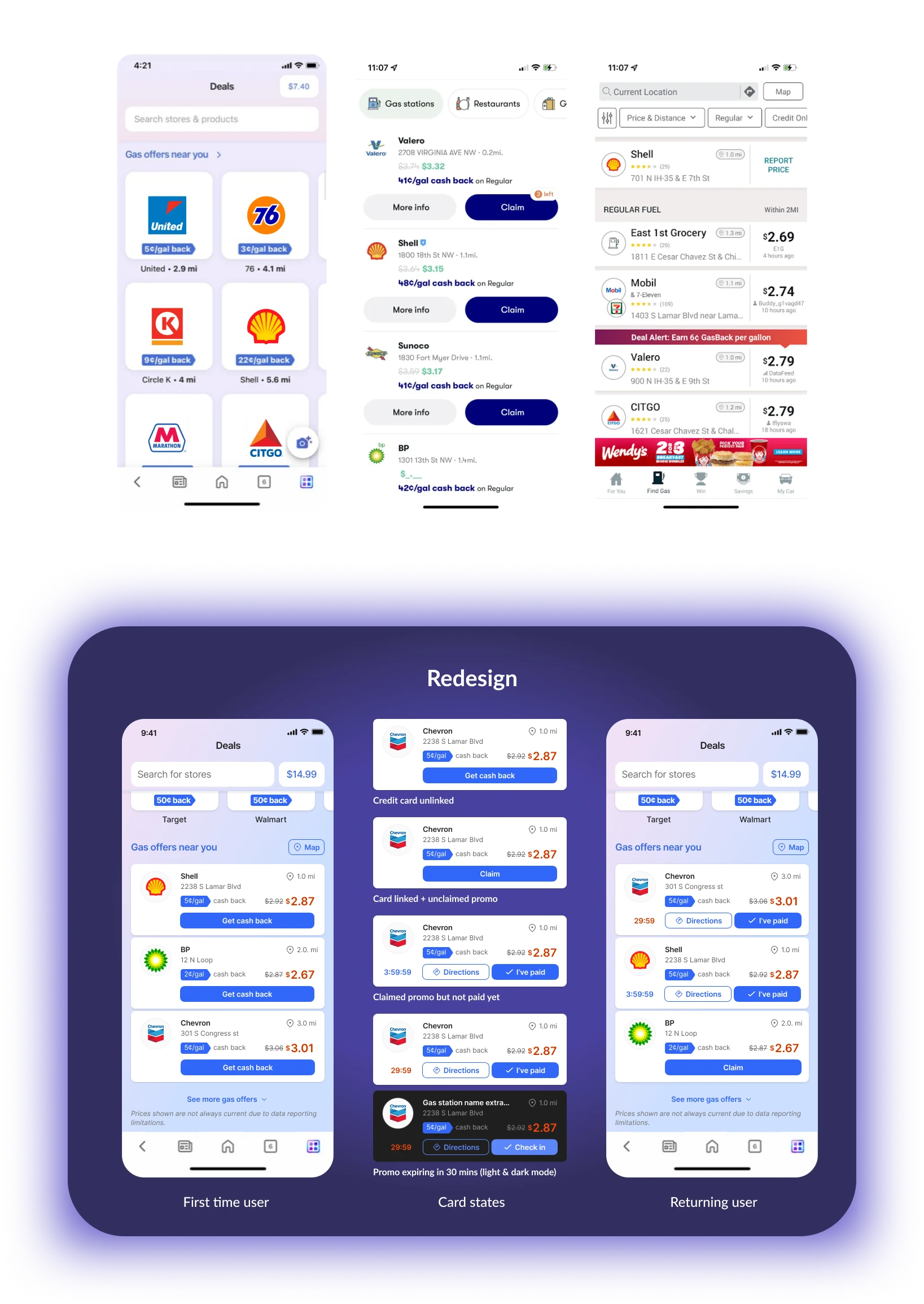
Shopping deals often come with numerous disclaimers, whether related to promo expiration or applicability to online or in-store sales. While there was an existing design for the offer detail drawer, it required revisions to improve the information hierarchy and ensure alignment with the overall Microsoft shopping experience aesthetic.
The gas promo significantly differed from Microsoft's other shopping deals. Therefore, I created a custom card tailored to its various states, incorporating elements from both the Fluent 2 iOS and Commerce UI kits. Additionally, I redesigned the gas offer section in the Deals hub page for both first-time and returning users.
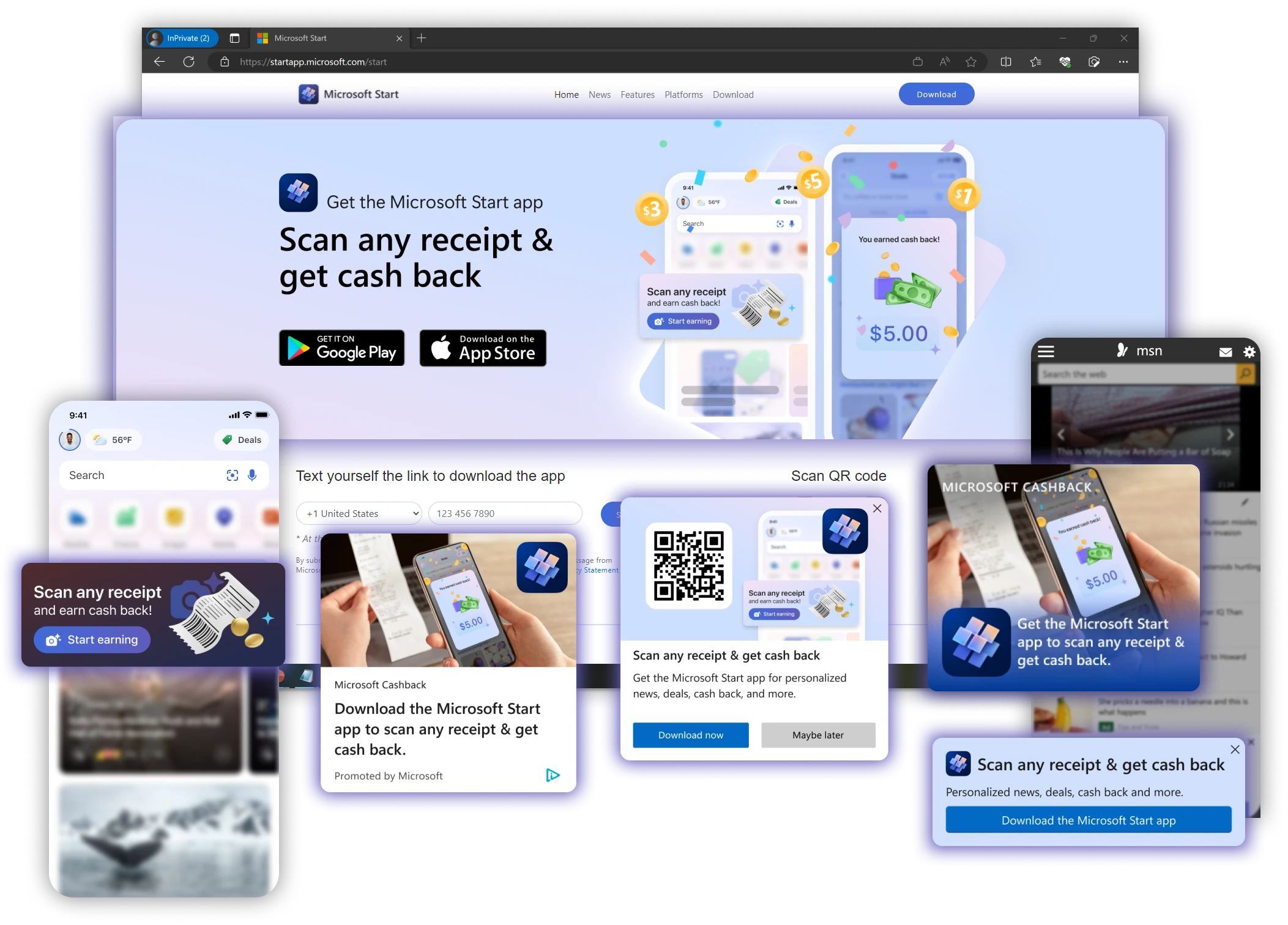
I also created a cohesive set of marketing assets to be used across many Microsoft platforms including Edge NTP, MSN homepage, Start homepage, and various social media channels.
From the time I joined until I departed from the team,

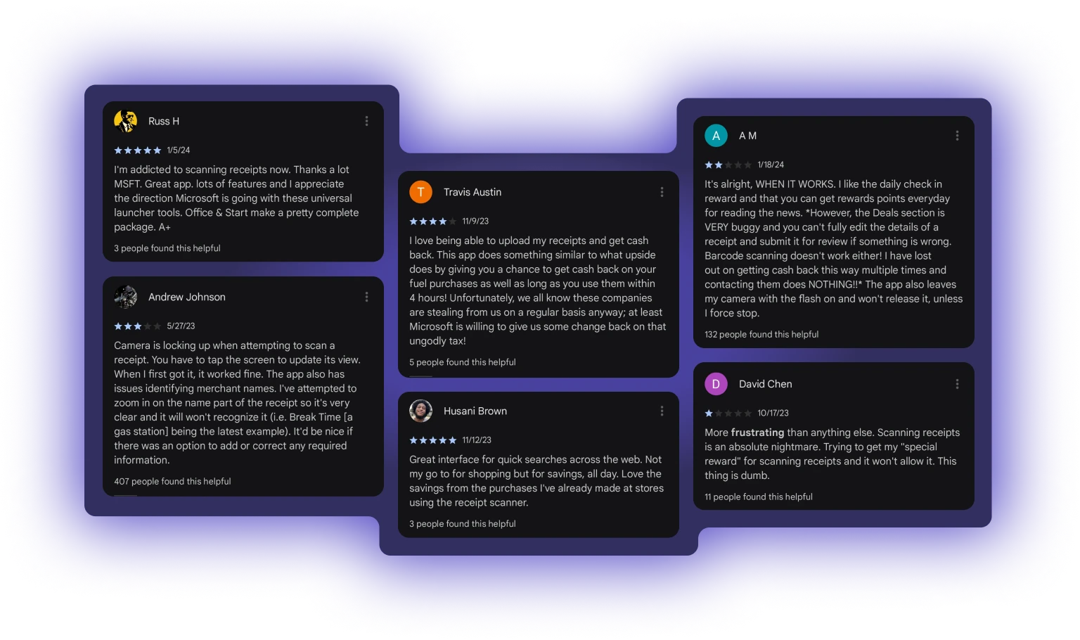
As of January 2024, the Start App where the Deals mini-app lives, boasts a rating of 4.2 stars based on over 2,200 reviews on the Google Play Store and 4.6 stars with almost 90,000 reviews on the Apple App Store, receiving a mixture of positive and negative feedback from users.
This was the 2nd design project I led while at Microsoft. Here are some of my learnings.
Getting design system buy-in
When I joined the shopping design team, our overarching goal was unification. A few months into the mobile shopping project, we realized our team lacked a solid process for selecting and utilizing design systems and UI kits. This lack of clarity led to confusion as we scaled up our product. Despite initial resistance from my project manager and engineering colleagues, I learned to effectively communicate the importance of a consistent design system. Additionally, I found that empowering engineers by guiding them on how to use the design system files themselves was highly beneficial.
Transparent management of tasks
In situations where priorities are constantly shifting, having a unified task list that is accessible to the entire team, along with regular synchronous reviews with key members, greatly aids in maintaining alignment.
In hindsight, I would have paid closer attention to online user sentiments and conducted more user testing to evaluate the actual need for the UI design requests at the time they were made. It's possible that the issue might not have been with the user interface itself, but rather with aspects of the user experience like app crashes, broken links, or unsatisfactory reward points.
Additionally, I would have conducted design audits earlier and assessed my team’s familiarity with and usage of design systems more thoroughly.
My experience at Microsoft Shopping provided valuable insights into the subtleties and challenges involved in a horizontal product and in an online marketplace. It also equipped me with strategies for navigating complex team dynamics and developing personal systems to maintain equilibrium while working on rapidly evolving products. I will carry this with me in my next journey.