This project started organically through the efforts of the sustainability advocates within the Microsoft Shopping team. For Phase 1, our team partnered up with sustainability rating agencies. As the product design lead, my main task was to incorporate the data we were getting from these rating agencies into the various Bing Search and Bing Shopping surfaces.
Disclaimer: A big part of what I worked on is still yet to be released in public. In this case study, I focused on the things that I can openly talk about.
User Research
Info Architecture
UX/ UI Design
Prototype
Presentation
Relationship building with partner teams
Figma
Photoshop
UX Lab
Fluent Design System
Bing Design System
10 months
6- 15 people (engineers, pms, designers, copywriters, business developers, marketing, legal, etc.)
User Research
Info Architecture
UX/ UI Design
Prototype
Presentation
Relationship building with partner teams
Figma
Photoshop
UX Lab
Fluent Design System
Bing Design System
10 months
6- 15 people (engineers, pms, designers, copywriters, business developers, marketing, legal, etc.)
This documentary trailer can explain it better than I can.

In the sustainability space, I personally think having more competition is better for the planet and for the people. We need all hands on deck. As an aggregator, some of the competitors co-creators I’ve looked at are Google Shopping, Amazon’s Climate Pledge-Friendly, and Earth Hero.


There were 3 main surfaces I needed to design for:
Working with multiple partners, inside and outside the company, was tricky. Everyone has an identity they want to preserve. Whether it’s the typography they’re using, the color of their icons, their brand name, etc. all of these had to consider when integrating their designs into our product.
Some of the questions I had to ask:
When this project started, there were 2 main design systems that the team was using - Bing design system and Fluent design system. This created a lot of confusion because Fluent is the company-wide design system to which everyone is trying to adhere. Yet my designs will mainly live in the Bing ecosystem.
As a compromise, we stuck with Bing design system for v1 and adopted Fluent for v2 expecting that Bing will eventually adopt it too.

Good On You rates fashion brands. Through the Ethical Shopping feature, when users search for a specific fashion brand on Bing, they will see an "Ethical Choice" badge on the brands official site on the search results page. Upon hover, they will see what that badge means including the ethical values that the brand practices and their impact on people, planet & animals. The info button also leads to an official site explaining how the rating system works.
When users search for a fashion product and go to the shopping page, they will see the ethical ratings and ethical values filters depending on the search results. Good On You's rating system goes from 1 to 5. But for our filters, we only show ratings 3 to 5 to incentivize brands that are scoring higher. Items from brands that gets an ethical rating of
“It’s a Start”, "Good", or "Great," would have an "Ethical Choice" badge on them. Similar to SERP annotation, hover would also show more info about the badge.
Ethical values filter allows users to filter results based on the sustainability values Good On You identified such as organic, vegan, eco-friendly, recycled or upcycled, fair trade,and gives back to community.
Users also have the option to shop directly from our Ethical shopping hub page. Here, we have sections separated by ethical values, brands, product categories, trending products, and price range. We also incorporated a section for ethical shopping news.
I redesigned the hubpage to make it look more modern and to make the user experience better. However, it hasn't been launched yet so I couldn't show it here. One of the most common feedback we got from user interviews was that sustainable products are expensive. So for the redesign, one of the biggest change I introduced was additional sections to accommodate budget-conscious shoppers.
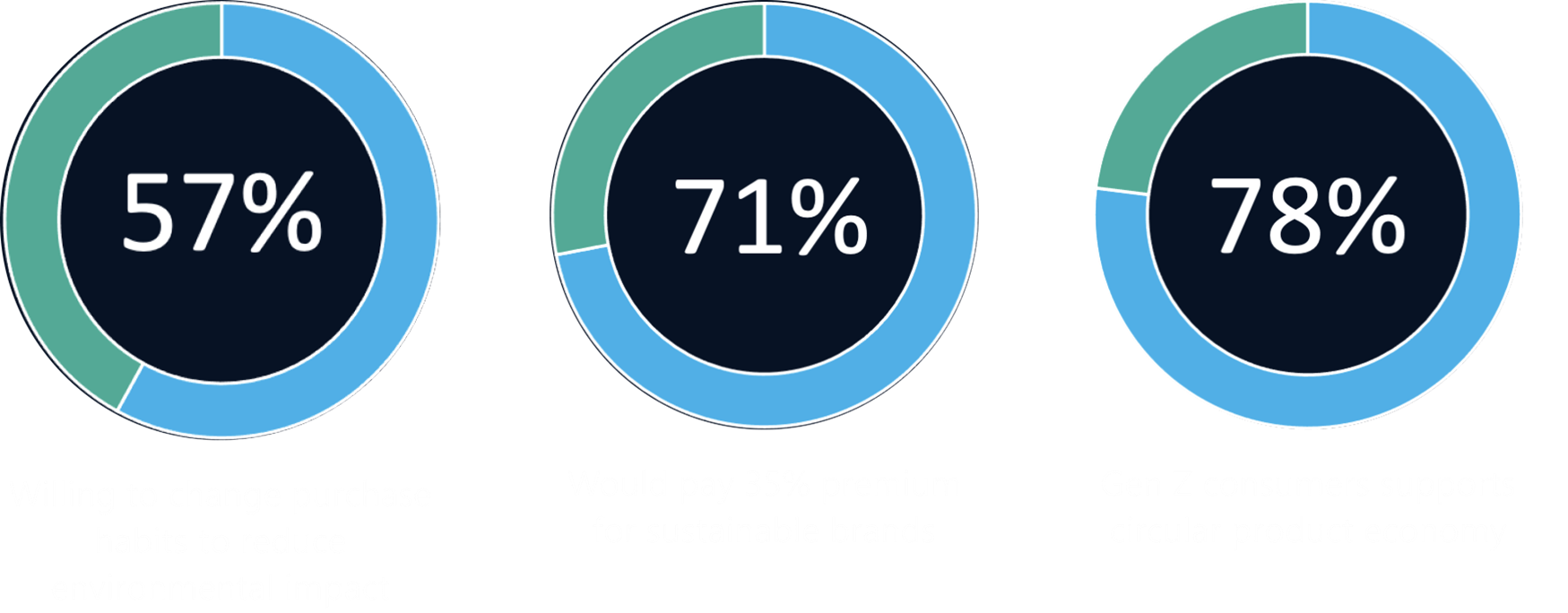
As of April 2022:

As the first project I led at Microsoft, I’ve learned so much from it. Here are some of them.
Navigating a complex team structure & driving alignment
Not only was the project started organically by people from different teams, we were also working with multiple partner teams internally & externally. Identifying how each member can best contribute to the project, building relationships with them, and driving alignment was key to our success.
Design system & file organization
By the time I came in, the existing designs were literally and figuratively all over the place. They’ve been worked on by different designers and were put in different Figma files with no clear indication of their iteration journey - Which came first? Which is still relevant? They also didn’t have a clear logic as to which design system was followed. I had to audit them and worked with senior designers on deciding which design system to use moving forward. I also created a Figma file organization template so that I and whoever browses my files would have an easier time navigating.
Internationalization
The plan all along was to launch the project in a few of the biggest markets of Microsoft. So making sure that the design can accommodate varying text length of different languages and that the copy was consistently coherent was a big consideration.
I would have done more user testing. When things are moving fast, getting feedback from users tend to take the backseat. I would also try harder to make sure the approved design actually comes through to the live product. Communicating the bugs early and persistently to the devs until they get resolved is something I would do differently.
I wish I also knew how to get more support from leadership.
I thoroughly enjoyed working on this project. Meeting and working with people who are passionate about sustainability wss invigorating. I’m eager to continue working in this space particularly in the realm of circular economy. I'd also love to continue learning how to make software design more sustainable.