
This is a school project.
We were already given a layout and we were tasked to tweak it according to our own liking- from UX Research all the way through coding its pages via responsive HTML and CSS.
User Research
UX/ UI Design
Info Architecture
Branding
User Testing
Front End Development (HTML/CSS/JS)
Google Forms
Illustrator
Photoshop
Draw.io
Balsamiq
Sketch
Invision
UsabilityHub
Lookback
Atom
Github
User Research
Info Arch.
UX/ UI Design
Branding
User Testing
Front End Dev. (HTML/CSS/JS)
Google Forms
Illustrator
Photoshop
Draw.io
Balsamiq
Sketch
Invision
Usabilityhub
Lookback
Atom
Github

Bombarded with information every minute of our lives, sorting and saving only the ones that actually matter to us has never been more essential. Blocbox aims to help us do just that.
MS Word, SD cards, and bookmarks were the most popular media storage people use. They still have their place. But as people become more agile, and the amount of data we consume keeps getting bigger, we need to create better storage.
The survey mainly revolved around the users current usage of their gadgets, their online browsing behaviors & the motivations for such behaviors.
of the content they browse is social media
Amount of time they use their laptops to browse content online
Likelihood of saving content that interests them
of the people who save content use the built-in bookmarking feature of their browser or app
of the content they browse is social media
Of the respondents have desk jobs or occupations
Write and keep notes to remember things for personal reasons
of the people who save content use the built-in bookmarking feature of their browser or app
I also asked about their backgrounds to see if there is a colleration between their occupation, hobbies, & their online habits.
Tool: Google Forms

30, Norway
Nurse

33, USA
IT Business Analyst

26, UAE
Document Controller
I compared 3 big names in the cloud saving and sharing industry namely:
I approached this step imagining how each of my personas would use the app based on their background. Each one had a different priority.
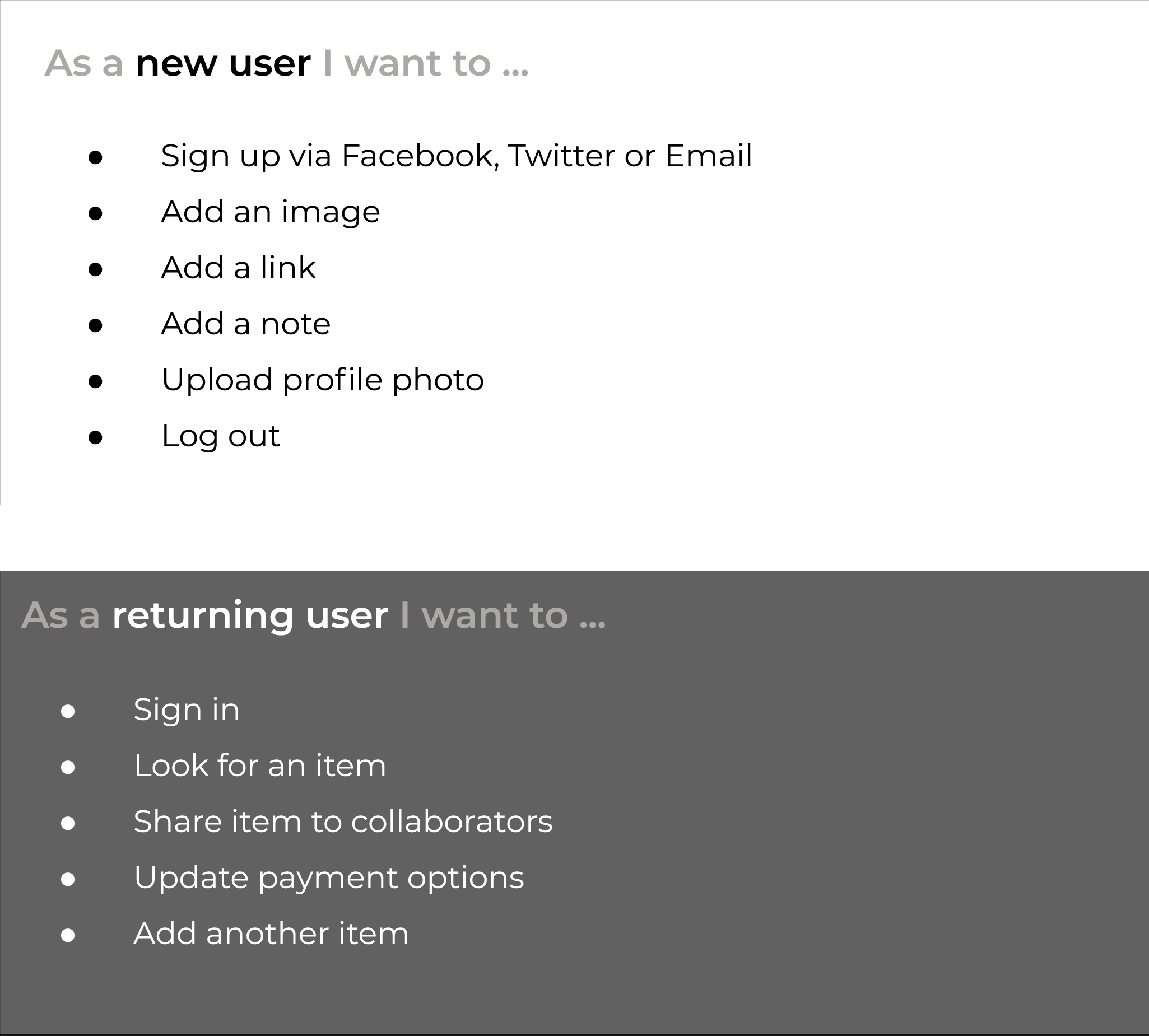
This visualizes the steps a user takes to accomplish each user story.
The design of the individual pages has evolved over time. These are some of the early versions of the design.
Tool: Balsamiq
For hi-fidelity mockups, the proportions and hierarchy of elements are more precise.
Tool: Sketch
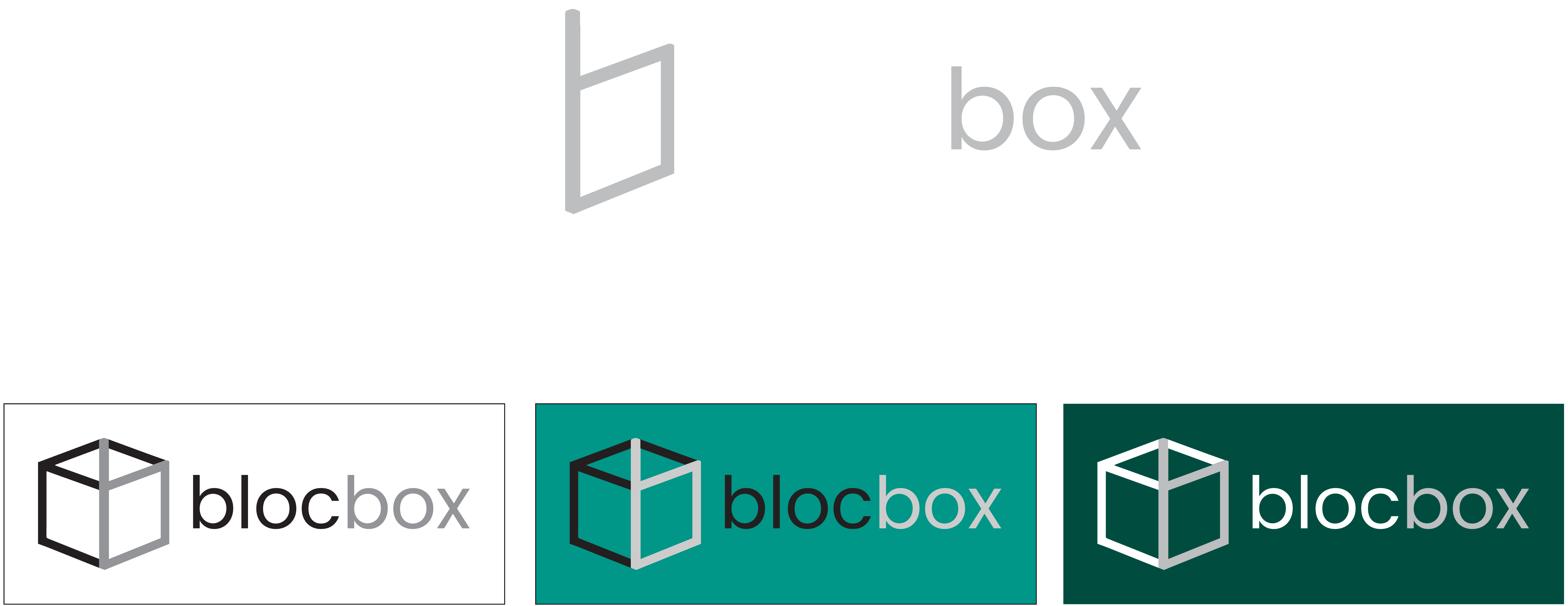
I was aiming for a minimalist and literal translation of the name “bloc” and “box.” Thus, the skeleton cube was chosen for the direct translation and the silhouette of the letter “b” was highlighted to represent “bloc".
Tool: Adobe Illustrator
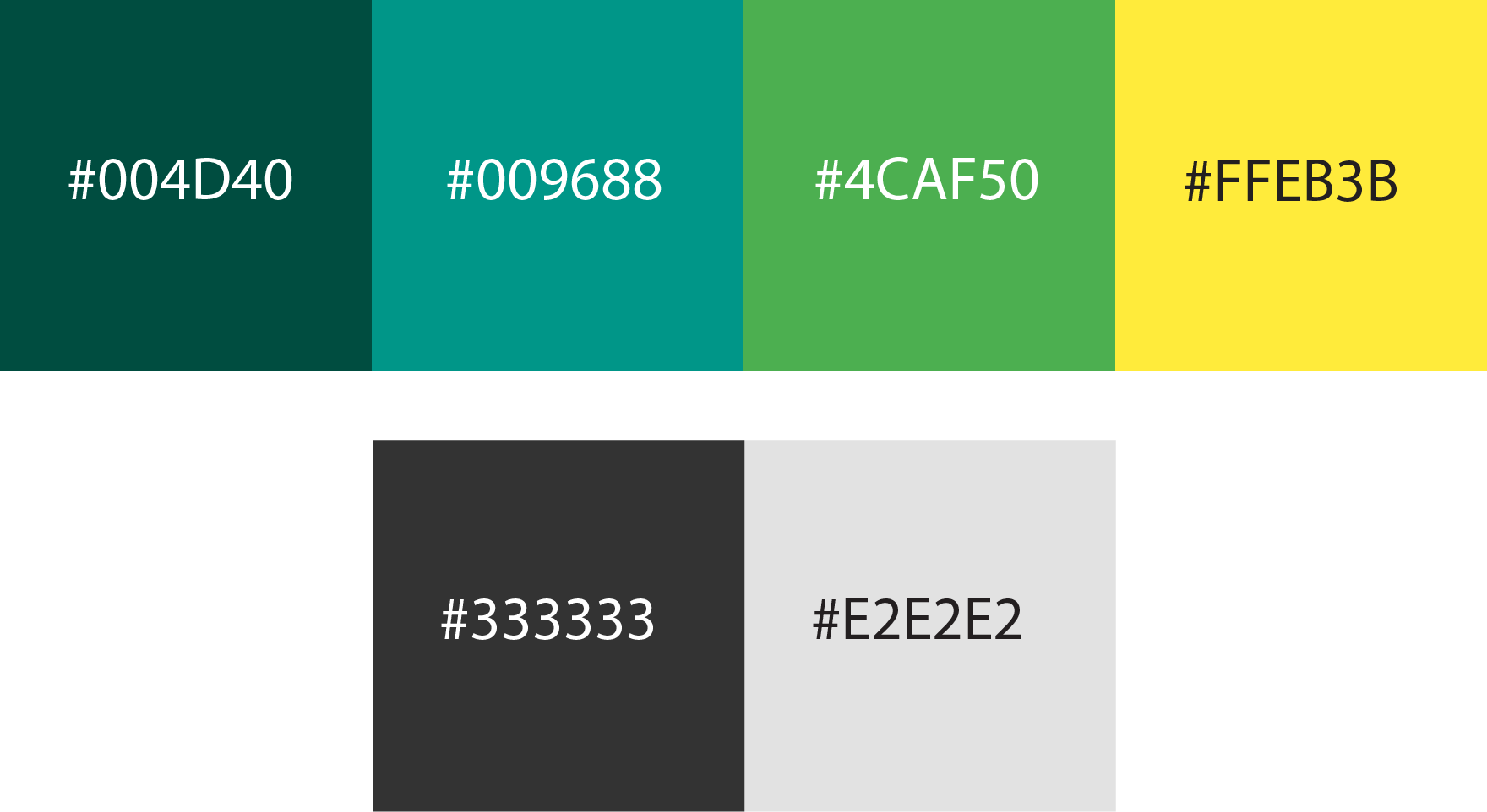
I want to make the website distinguishable from the blues of MS Word and Box and from the greens of Evernote. while still maintaining the professional and trustworthy look of it. Thus, I went for the middle ground which is teal. And I use complimentary colors to complete the set.
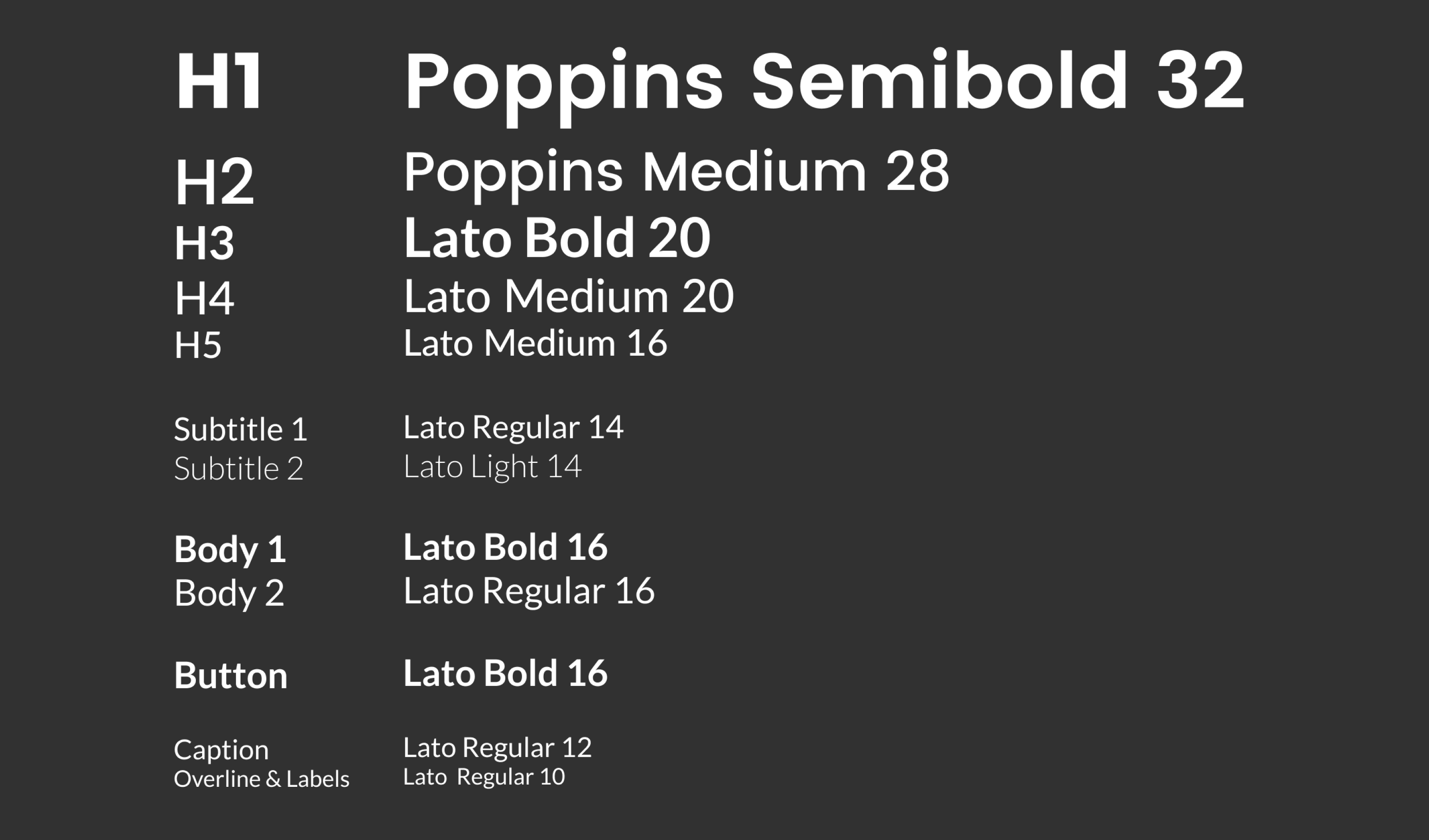
Aiming for clean lines, picking san serif typefaces came natural. I chose Poppins for the h1 & h2 and Lato for the rest of the text. Both were chosen for their circular geometry which gives a sense of friendliness.
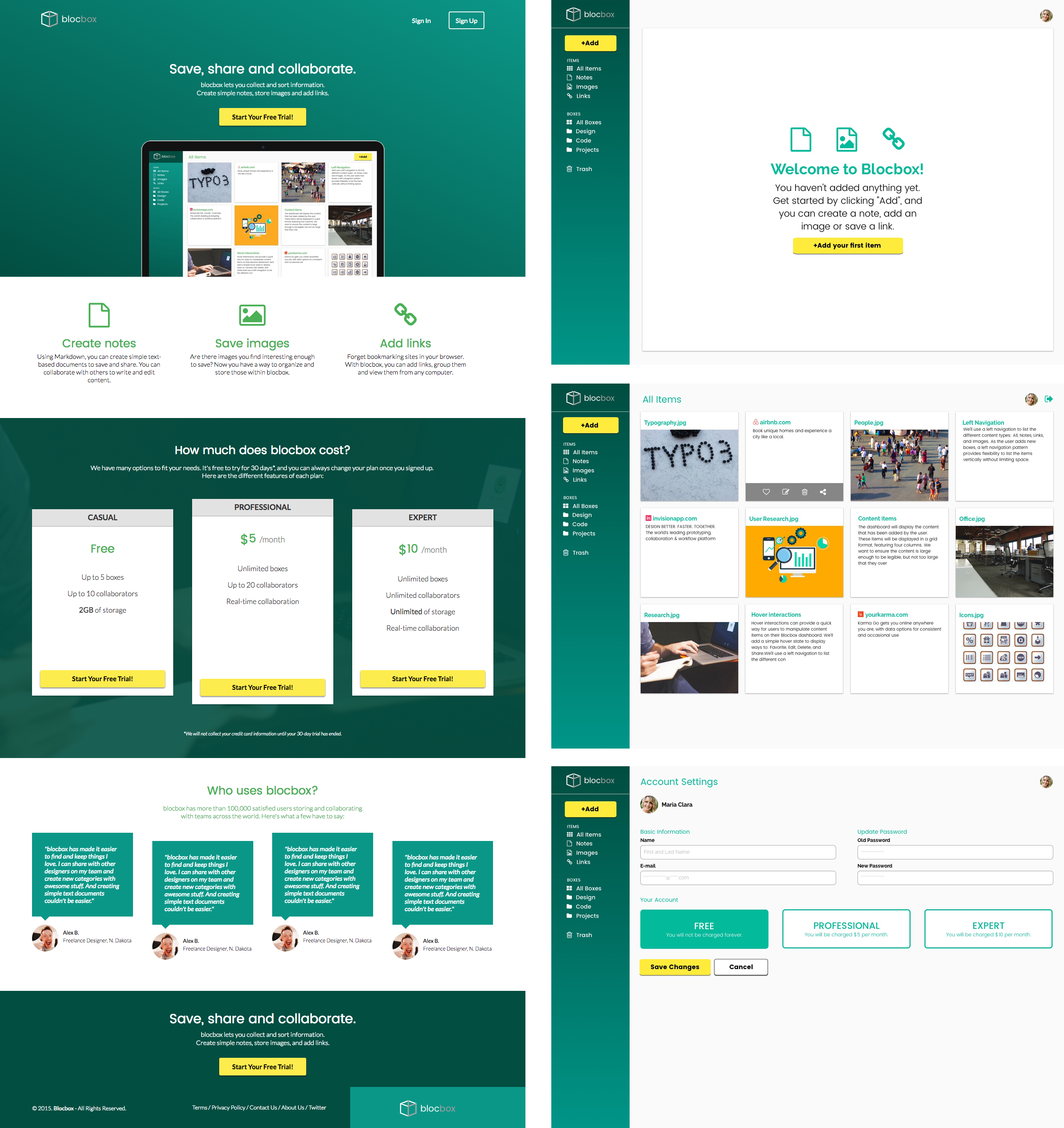
The layout, color choices and placement of elements changed as I get more feedback from users. These are some of the mockups.
Tool: Sketch
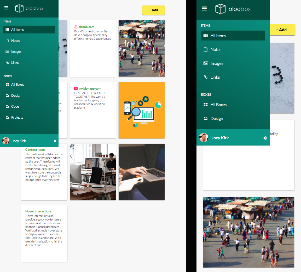
One notable change from the laptop view is the usage of a drawer menu.
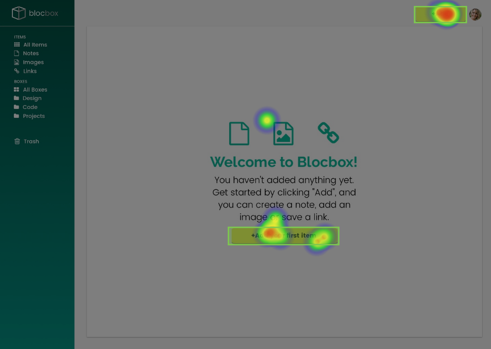
In general, early testers of the site find the design clean and very easy to navigate. It’s intuitive and trustworthy looking. Although there was one flaw that has been consistently brought up by the testers. It was the difficulty of finding the settings button. With the current testing tool that we were using, the bottom 5% of the screen is hidden. Thus, testers needed to scroll down to see the button.
Tool: Lookback, UsabilityHub
In summary, the site was successfully designed. The positive feedback has triumphed over the negative. There were things that could have been improved like the placement of the settings button and possible addition of the trash bin., Although overall, the product was a successful MVP.
If I could do it differently, aside from correcting the flaws said earlier, I would also compare the layout of Blocbox to the layout of other competitors. That might have given me a better idea on the necessary and unnecessary features of a good cloud storage platform. I would also add a footer on every page to make them more cohesive. I will incorporate the add button in the dashboard boxes instead of creating a dedicated box on the top right corner of the screen. Lastly, I will put a search box where the add button is currently at.